Back to Blog
Follow us


Timelessness. Enduring. Trend-agnostic.
This facet of long-lasting design is one that we’re incredibly familiar with at Tom Howley, and it’s perfectly understandable. A kitchen is a lasting investment piece that will last for years to come. Trends change in interiors more quickly than ever before, so the fear of making a choice that will quickly date is one we see on a regular basis. For this reason, neutrals have reigned supreme in kitchen design for decades.
This isn’t to say a neutral kitchen can’t be beautiful, timeless, and full of personality. However, we’re seeing more and more people drawn to bold colour in all kinds of iterations and ways in their kitchen. From small accents to fully colour-drenched projects, bolder shades are here to stay.
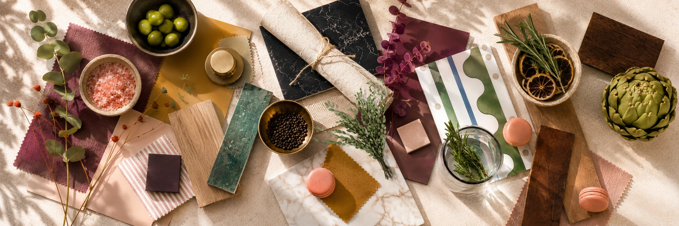
With this in mind, we’ve developed four bold new colours in the Tom Howley range, expanding our palette to bring moments of joy, warmth and personality by inspiring colour confidence, whatever that looks like for your kitchen.

The interiors landscape is changing.
On average, we’re moving house less as a nation than we have in the last decade. Homeowners are staying put for longer, particularly later in life, and they’re investing in what they have rather than moving on.
For interiors, that means design choices are now being made for long-term enjoyment, not just future equity.
After years of making sensible decisions in the home – “Will this work for my family?”, “How could this affect my resale value?” – homeowners are putting themselves first. The new question is “What kind of interiors do I love?”, “What have I always wanted in my home?”, “What will make me happy?”. This is where exciting, creative, bespoke kitchen design lives.
Colours like rich burgundy, earthy pinks, joyful yellows and richer greens are growing in popularity as a result, the “safe” kitchen palette – cool greys, bright whites, and stark neutrals – is being left behind. These new tones feel expressive and personal but also have a warmth and timelessness that futureproofs your current home for long-term living.
We’re so excited to release four bold new colours in the Tom Howley range, expanding our palette to bring moments of joy, warmth, personality, and colour-confidence to our clients’ homes.
These colours were born of a desire to expand our palette in line with our clients’ expanding tastes, and to create kitchens that feel right for now and in years to come. Whether you’ve always dreamed of a colour-forward kitchen, or are starting to imagine how a kitchen that doesn’t rely on neutrals could feel, our designers are here to help.
These colours have been chosen to work seamlessly within the timeless Tom Howley colour palette, while also providing moments of brightness and boldness.
Backed by a meticulous research and development process, the new spring colours are bold and forward thinking, but with a versatility that makes them feel seamless and useable in all kinds of kitchen designs.
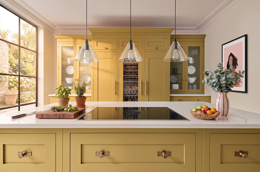
A near-universal symbol for warmth and happiness, yellows in interiors are all about emotion.
With Sandstone, we’ve melted sun-warmed rocks and golden middays into a shade that is soft, saturated, and utterly joyful.
While it might seem like a very bold tone on the surface, Sandstone also acts as a warm neutral in the Tom Howley palette, adding a ray of sunshine into any design.
“A pale mustard shade like Sandstone is a great addition to the Tom Howley collection, and can feel really timeless when paired simply with natural materials and finishes.” – Lucy Nash, Tom Howley Designer
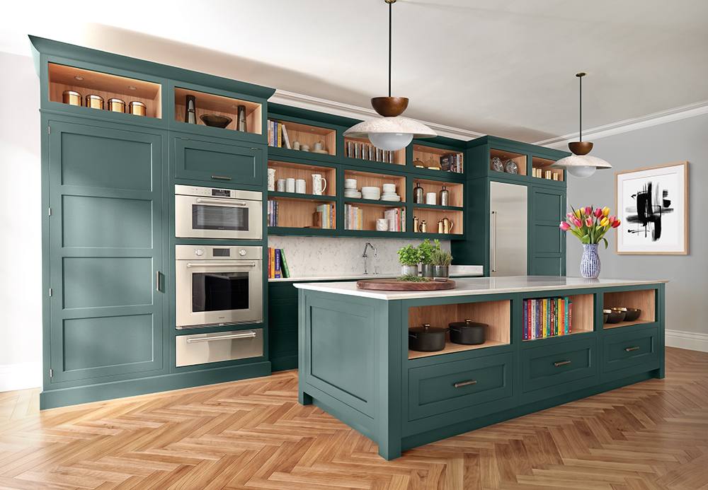
Green kitchens have become ubiquitous over the last decade, acting as a new neutral for kitchen spaces. Soft muted greens, like sage and fern, are a huge part of the kitchen landscape, this, combined with the softer, calming tones we’re seeing a lot of, can have earth-toned kitchens feeling less sage green, and more safe green.
Sea smoke takes these familiar kitchen green tones, and puts a coastal twist on it with a deep mineral teal undertone.
Full of rich visual dimension, this is a tone that feels big and bold, whether that’s in small accents or all over the kitchen.
“These new colours feel calm and regal with a lovely heritage feel, especially Sea Smoke. It also has a real sense of depth and is highly pigmented, which is important when committing to timeless colour in a kitchen.” – Connie Sharp, Tom Howley Designer
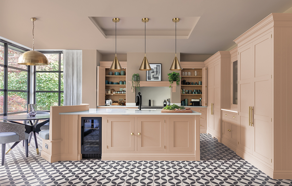
Since as far back as 15 years ago, pinks have been a part of the modern home design playbook. The specific tones and shades have varied over the years, but it’s clear that this warm, feminine shade is here to stay.
Our interpretation of pink is a light, airy, plaster pink. It feels like new beginnings, fresh air, and morning sunlight.
As a light, desaturated pink tone, Pink Salt is fantastically versatile – it can be a bolder bridging colour on its own, or act as a unique neutral against deeper, more saturated shades.
“Pink Salt is a great starting point for anyone nervous about moving away from neutrals, as they introduce colour without feeling overpowering. I always encourage clients to choose colours they genuinely love, as they will always feel timeless.” – Connie Sharp, Tom Howley Designer
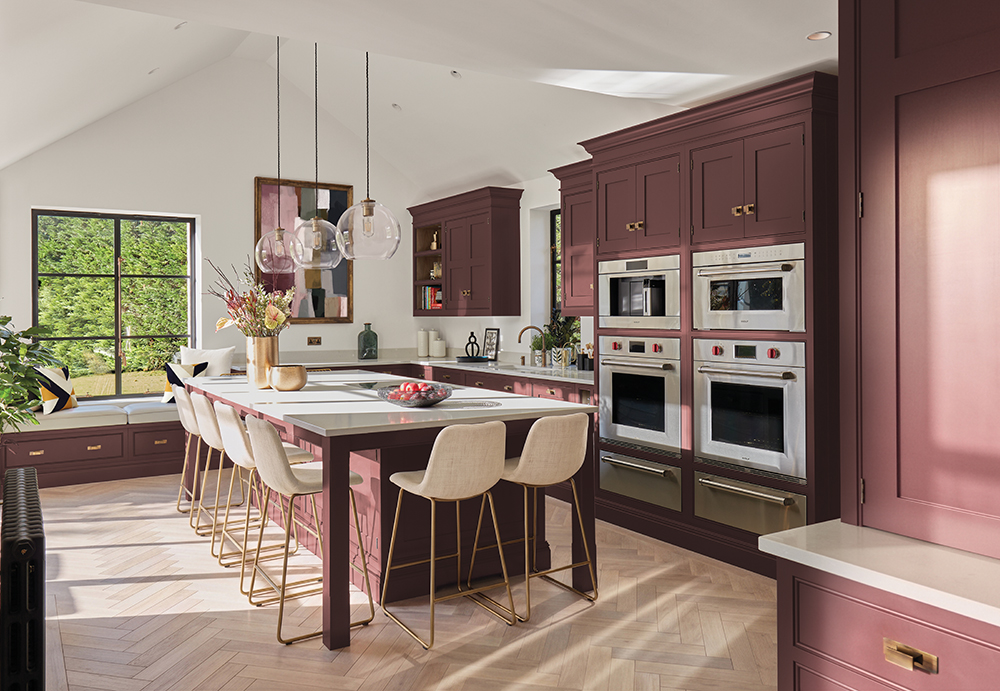
The rise in rich, naturally-inspired deeper tones – like chocolate browns and burgundies – is clear to see in 2026 interiors.
Our last colour launch featured these natural tones (Sumac and Hazlewood), and with this launch, we looked at ways to take this trend in a slightly different direction.
The result is Sloeberry, a dramatic aubergine purple inspired by the deep, lustrous tones of hedgerow berries, that provides visual interest and warmth for kitchens that feel fresh and unique for years to come.
“I’m really looking forward to working with Sloeberry and can see this working really well in smaller rooms like boot rooms and utility rooms, in particular.” – Suzie Francis, Tom Howley Designer
Over the next few weeks, the Tom Howley experts will be diving deeper into what these colours mean for our clients, the colour trends for 2026, and how colourful kitchens spark joy while retaining that sense of timelessness and personality.
If you’re looking to escape the safe kitchen, or just want to be inspired by how expert kitchen designers use colour in ways you might not have expected, watch this space, and when you’re ready, book a visit to one of our UK kitchen showrooms.