Back to Blog
Follow us


This year, two new paint colours have joined the Tom Howley palette: Hazelwood and Sumac. One is deep and grounding, the other bold and full of character. Together, they mark a new chapter in the way we think about colour in the home.
We sat down with Creative Design Director Tom Howley to discuss the inspiration behind these shades, how they were brought to life, and the moods they evoke when layered into a kitchen scheme.
These shades reflect the atmosphere of the season, they’re warmer, richer and more cocooning, yet still timeless. Hazelwood and Sumac are designed to bring lasting character and depth to a kitchen, regardless of trends or time of year.
I think what makes them feel particularly relevant now is the shift we’re seeing in how people use colour at home. There’s more confidence, more individuality, and a growing desire to make bold but considered choices. Kitchens that reflect personal style, spaces that feel lived-in and uniquely their own. These new colours, alongside our full palette, support that way of designing.
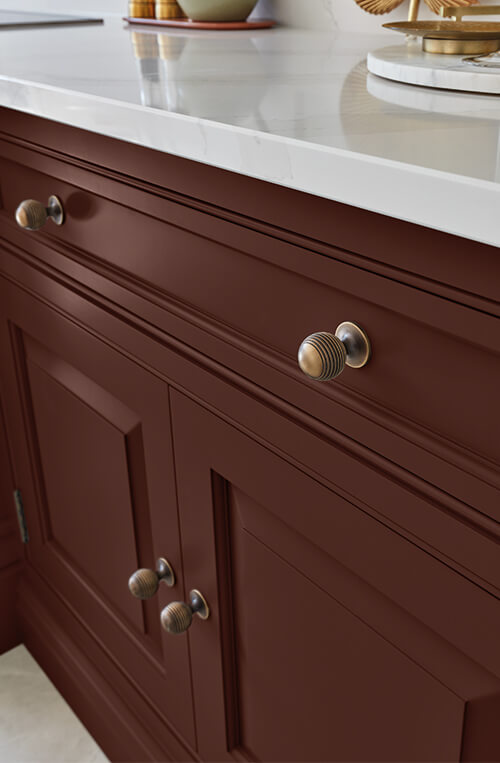
Hazelwood feels calm, natural and comforting. It has weight and subtlety, but never feels heavy in a room, despite being a dark colour. Sumac is elegant and confident, it’s warm, bold and full of heritage character. It reflects classic interiors: deep velvets, antique furniture, and traditional ceramics.
Both these shades are timeless choices. They support the wider design story in a home, working seamlessly with natural materials, textured finishes and layered tones. They’re not colours you’ll tire of; they become part of the fabric of the space. It’s not just about how a colour looks, it’s about how it makes you feel in the space. That’s where the value is, in creating a timeless interior that feels like you.
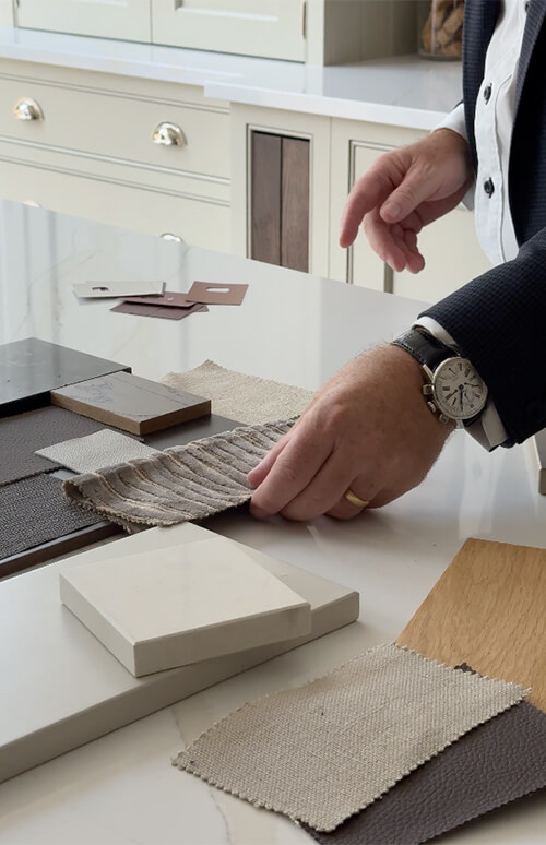
Colour development always starts with instinct. I spend a lot of time in our showrooms and with clients, so I get a clear sense of how tastes are evolving and where interior design is heading. I take inspiration from design exhibitions, architecture, fashion, and conversations with my peers, including the interior designers I work alongside. As a brand and a team, we’re constantly absorbing those wider influences.
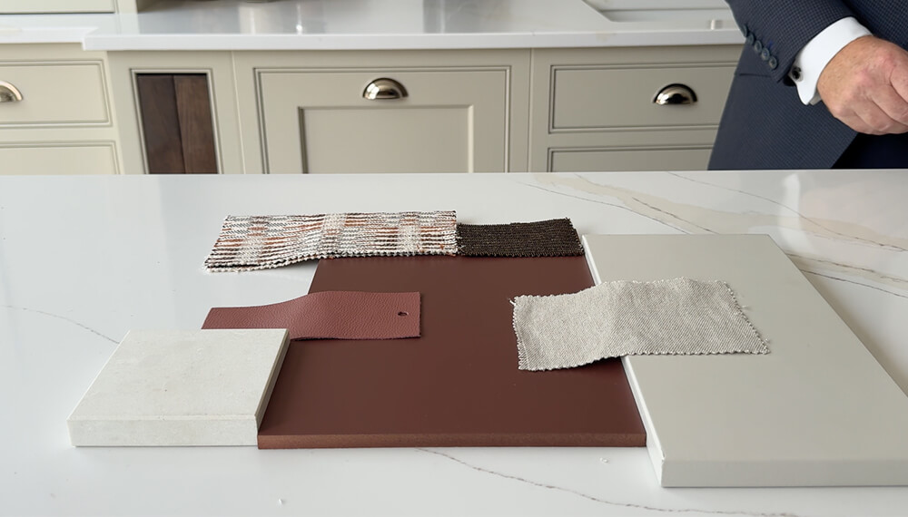
From there, I’ll review our existing palette and look for the gaps. Is there a tone we’re missing? A finish that would complement a certain cabinetry style? A deeper, more expressive colour that feels aligned with where design is moving? That’s when the refinement begins.We undergo multiple rounds of sampling, checking how the colour appears in different lighting conditions, how it performs across our cabinetry ranges, and how it complements materials such as worktops, flooring, and hardware. It’s never just about the paint; it has to work across the whole scheme. We keep going until the colour feels right and we’re confident in both its longevity and its appeal, with our clients in mind.
It’s not just about choosing a colour that looks good on a swatch. It has to work in real homes, with real materials, and across a fully considered space. That’s how you create timeless luxury that feels effortless.
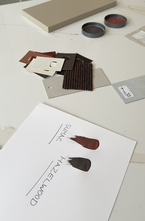
At Tom Howley, colour names are deeply inspired by the natural world, often drawing from landscapes, botanical elements, traditional materials, and seasonal tones. Names are crafted to evoke a sense of place, texture, and emotional warmth, sitting at the intersection of classic British craftsmanship and contemporary interior design.
It’s always about balance. With Hazelwood, it was about making sure the brown had warmth, but not too red or too flat. Sumac needed to feel rich, usable and not too sharp. I wanted new colours that our designers can work with easily, that clients will want, and that have real presence in a space. A good paint colour in the kitchen doesn’t dominate; it supports and complements everything else in the room.
Hazelwood has a natural warmth that makes it a strong base for our cabinetry. With its brown undertones rooted in nature, it pairs beautifully with lighter neutral tones, textured timbers and soft metallics, perfect for creating kitchens that feel calm, balanced and inviting.
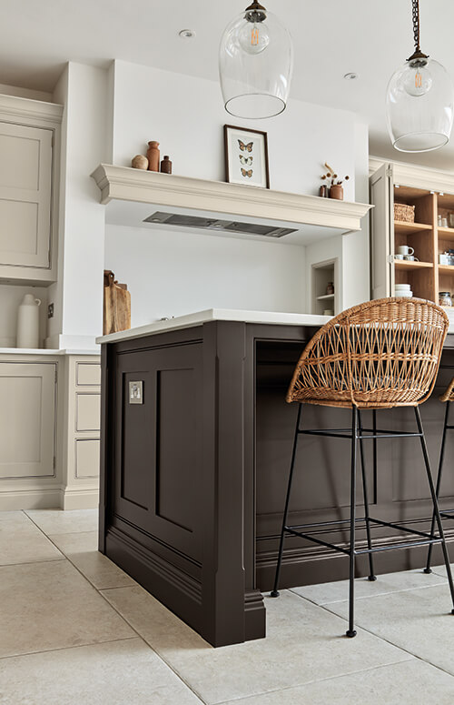
Sumac works particularly well in a two-tone scheme. It adds richness and contrast, either as a statement island or across the perimeter cabinetry, balanced with a lighter, complementary colour. It’s a bold choice, but one that pays off by bringing real personality to a space.
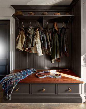
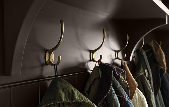
Both shades work well in smaller spaces like pantries, boot rooms and utility areas. These rooms often have less natural light, so embracing a darker palette can actually make a space feel more cocooned and inviting. When styled well, these deeper shades add atmosphere and a considered, layered finish.
Deep or bold colours work best when combined with lighter tones and natural textures. A dark island paired with softer painted cabinetry and a natural stone worktop creates visual contrast and a real sense of balance.
I also like using bold colours in transitional spaces, such as walk-in pantries or boot rooms, the rooms you pass through often. They’re a great opportunity to introduce something expressive that brings you joy, without overpowering the main living areas.
The key is always to consider the whole design. Bold colours should feel like part of a larger, layered scheme, not something that fights for attention.
I am seeing a move toward richer, more natural tones in interiors. Browns and reds are definitely coming through in the mix, in fabrics, furniture, and patterned heritage-style tiles. But there is also a strong desire for colour that still feels classic. These two shades feel relevant to that shift: natural, warm, easy to build around, and suited to both modern and traditional interiors.
Ultimately, the real trend now is not to follow trends! It’s about choosing a characterful, natural colour that feels personal to you and timeless—something you’ll love living with for years.
We always design for longevity. Even when we introduce a colour with a seasonal story, we make sure it has the quality and tone to last well beyond that. We want clients to still love their kitchen, or their home, years down the line. That’s why we’re careful about choosing shades that feel current but won’t date quickly.
Discover Hazelwood & Sumac in our Seasonal Colour Edit Lookbook — download your free copy here.