Back to Blog
Follow us


Over the next month, we’re delving into the world of colour, from expert advice on using colour in the kitchen to trending schemes and techniques for injecting bold hues into the home.
If you have a craving for colour and are looking to transform the heart of your home, it’s best to understand a few colour theory basics.
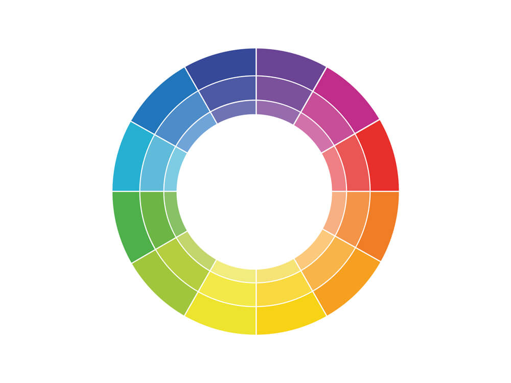
There are three classifications on the colour wheel that act as the foundations to all interior colour schemes: primary, secondary and tertiary. Understanding how these colours work together is key to a successful interior colour scheme.
Primary: red, yellow and blue. These three colours can’t be mixed and are essentially the starting points for all other colours.
Secondary: orange, green and purple. These colours can be mixed by adding two primary colours together.
Tertiary: red-orange, red-purple, yellow-orange, yellow-green, blue-green, blue-purple, red-purple. To create tertiary colours, you combine secondary with primary colours.
Hue: this refers to a pure colour that doesn’t have any black or white added to it – for instance, one of the six primary and secondary colours.
Tint: a tint is created by adding white to a hue. This increases the lightness of the original colour.
Shade: a shade is created by only adding black to a hue.
Tone: adding grey (black + white) to a hue will create a tone. Tones can be lighter or darker than the original hue.
Saturation: this refers to the intensity of a colour. A fully saturated colour is pure (100% colour), and a 100% desaturated colour appears as grey.
Now we have a few colour theory basics covered, let’s talk colour schemes. A scheme is a combination of colours from the wheel that work well together, usually down to personal preference. When carefully constructed, this palette of colours can be one of the most defining aspects of a space, setting the tone and mood. Here are a few examples of schemes you can follow in the home:

Analogous: an analogous scheme is made up of three colours that sit next to each other on the colour wheel. Typically you’d centre your palette around one dominant colour (usually a primary or secondary colour), with one supporting colour (a secondary or tertiary colour) and another colour as your accent. An example of an analogous scheme could be blue, blue/green, green. Interior designers often use the 60-30-10 rule. This means 60% of the space is your dominant colour, 30% is your supporting colour, and 10% is your accent. Your dominant colour doesn’t have to be in the form of a wall colour; you can build your scheme around a large piece of furniture such as a kitchen island or statement rug.

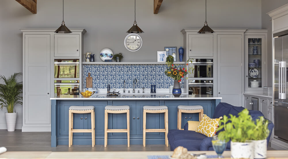
Complementary: complementary colour schemes use two colours that are opposite each other on the colour wheel, often one warm hue and a cool hue. Typically one colour is more dominant, and the other acts as a contrasting accent creating a high impact scheme. For example, blue and orange, yellow and purple or pink and green. These colour combinations should be carefully considered and offset with neutrals to achieve balance within a space.

Triadic: this scheme refers to using three colours that are equally spaced (creating a triangle) on the colour wheel. If you want to get creative with colour and inject personality into a space, this scheme is perfect. You can create triadic colour schemes with primary, secondary and in-between hues. Try orange, deep green and purple or dark blue, burnt red and yellow. As it’s a high-contrast, often playful scheme, it’s most commonly used in bedrooms, snugs and playrooms. You can always tone down the palette by sparingly using the three colours combined with a neutral base colour.

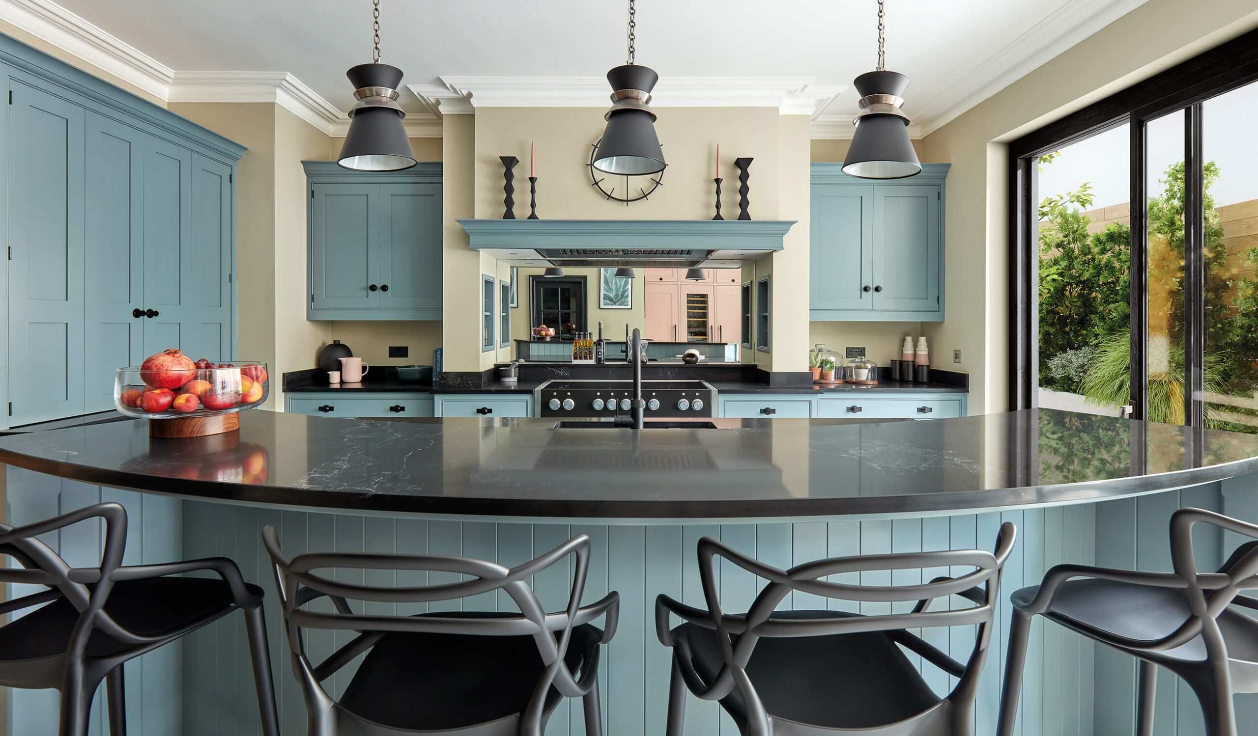
Monochromatic: commonly misunderstood as black and white, a monochromatic scheme is created using varying tones, shades and tints of the same hue. Using a monochromatic blue scheme in the kitchen can add depth and visual interest to the space.
Design Director, Tom Howley explains, “For a style statement, create impact using the same colour-on-colour rule for kitchen cabinets and island counters. You can also expand this colour into tiles, backsplash and soft furnishings in open plan spaces, such as sofas, cushions or upholstered bar stools.”
Remember, you’re not restricted to using the above colour schemes. Get a feeling for what colours work for you and the space in question, pull together moodboards and have fun finding your perfect palette. We’ve shared top tips and advice on using colour in the kitchen from leading interior experts here.