Back to Blog
Follow us


Tom Howley kitchens are traditional by nature, but that doesn’t mean we can’t elevate our designs and help homeowners express themselves through intelligent use of colour. With a resurgence in colourful kitchens and interiors, we thought we’d share some of our exclusive bold shades along with colour predictions for the year ahead.
Wellness, sustainability and interiors with a distinct sense of personality have been prominent trends throughout 2021. Whilst we continue to move in this direction with our interior schemes, people are also becoming increasingly brave with colour, opting for adventurous earthy tones and brilliantly bold hues.
WGSN and Coloro recently announced key colours predicted to gain popularity in 2022/23. These forecasted colours reflect the world we live in today, focusing on wellbeing, stability, balance, and a desire to explore new possibilities. The robust palette consists of serene pinks, nourishing greens, versatile yellows and tranquil blues that promise to resonate with homeowners and interior designers alike. It’s these statement colours that are set to dominate with their ability to transform our homes.
When it comes to introducing paint colours to our palette, they often blossom organically. We still acknowledge trends and broader industry insights, but ultimately, the colours we choose always have a timeless quality, achieving that classic Tom Howley feel that we are renowned for. Rather than overwhelming clients, we have 24 carefully chosen Tom Howley paint colours in our exclusive palette, ranging from traditional neutrals such as Tansy and Sorrel to distinctive free-spirited brights like Serpentine and Azurite.
Our bolder shades have been painstakingly curated to withstand trends and the test of time, whilst most importantly appealing to a wide range of personalities and property styles. Here are just a few of our brilliant brights, bound to satisfy your craving for colour.
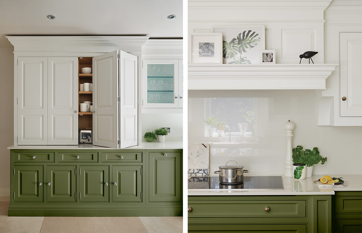
Green kitchens are having something of a moment right now. As a colour we associate primarily with nature, this grounding shade has an incredible way of reconnecting us with our surroundings, creating moments of calm and positivity.
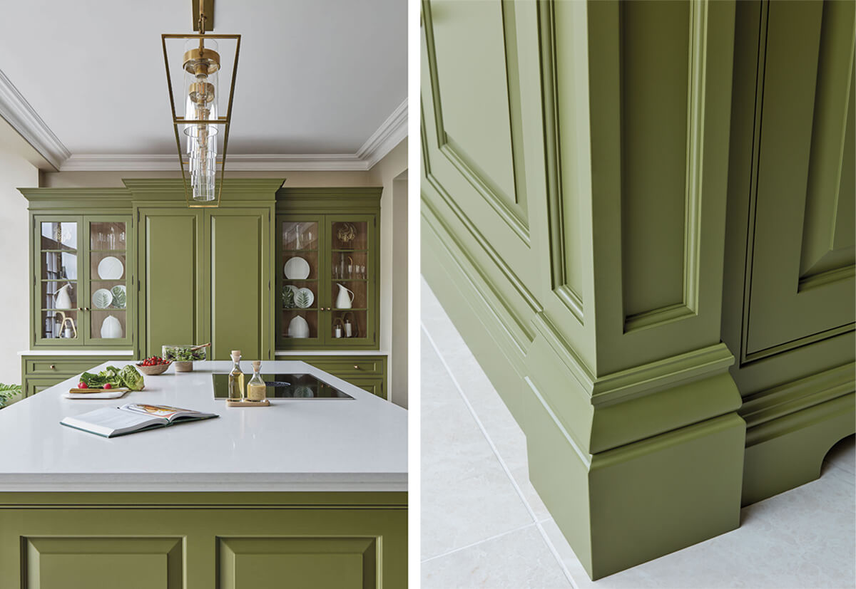
Serpentine, our striking olive green, is used to splendid effect here in our latest Devine design. It’s a stunning colour with earthiness and depth that leaves you feeling nourished and full of life, perfect for kitchen environments. This bold colour may pack a punch, but you have a scheme with undeniable appeal when combined with burnished brass hardware and Caesarstone Organic White worktops.
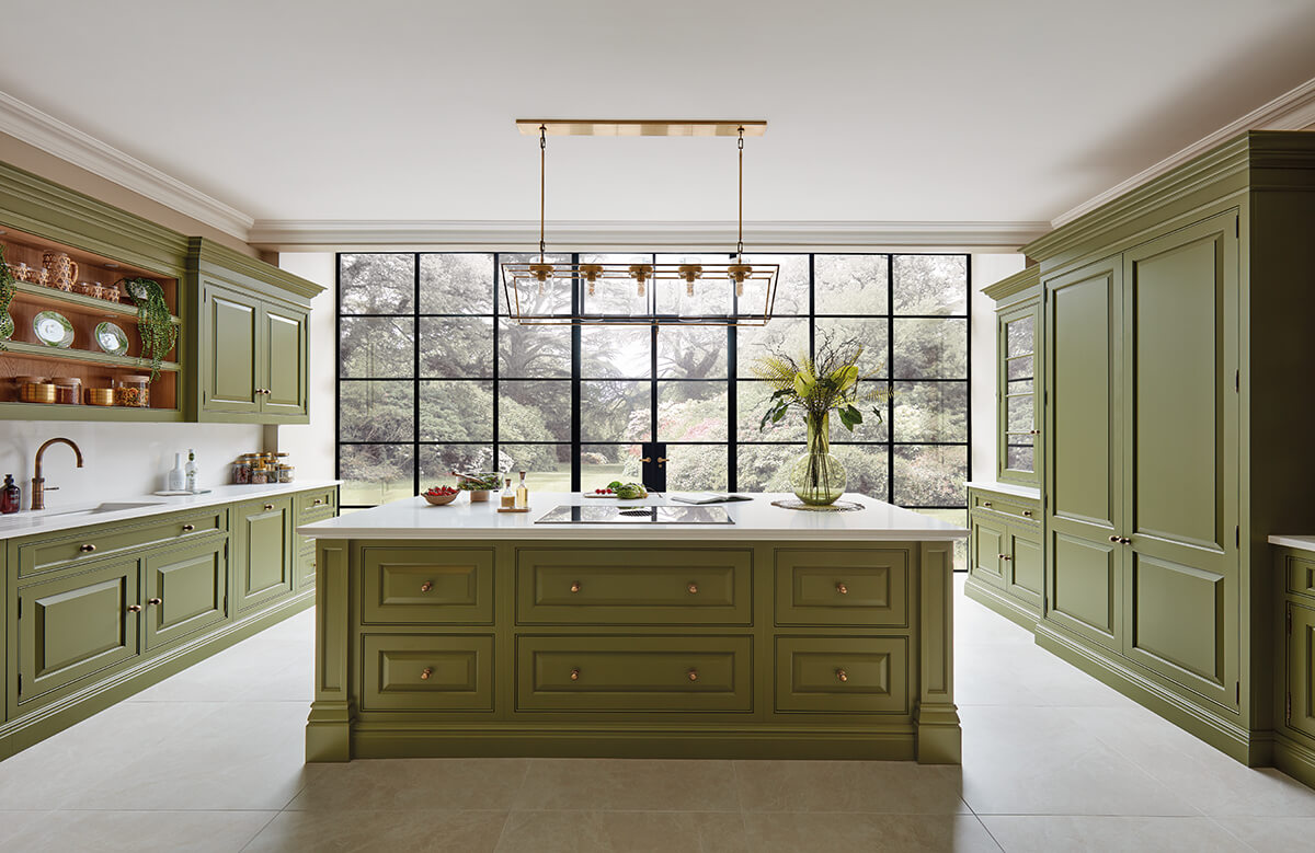
As an adaptable colour, green can be used on its own or combined with other neutrals and whites. To balance out strong colours such as Serpentine, we suggest incorporating wooden accents and textural layers to create a warm and inviting atmosphere.
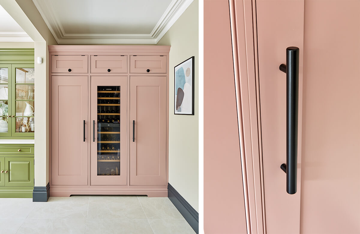
If colourful kitchens are your thing, then a touch of pink may be on the cards. Pink Dusk is not like your usual bubblegum pink. It’s incredibly soft, charming and moody. It’s a colour that imbues warmth and gives a homely glow perfect for bringing a sense of comfort to the home.
The kitchen is the soul of the house, so don’t hold back when wanting to inject personality and visual interest into your space. Pink can be as versatile as you like. Pair it with soft neutrals and woods or zesty greens and blues for an energetic, more playful look. As a welcome burst of colour in this kitchen, we’ve paired our confident pink with matt black hardware, an alluring mid greige wall colour and contemporary artwork.
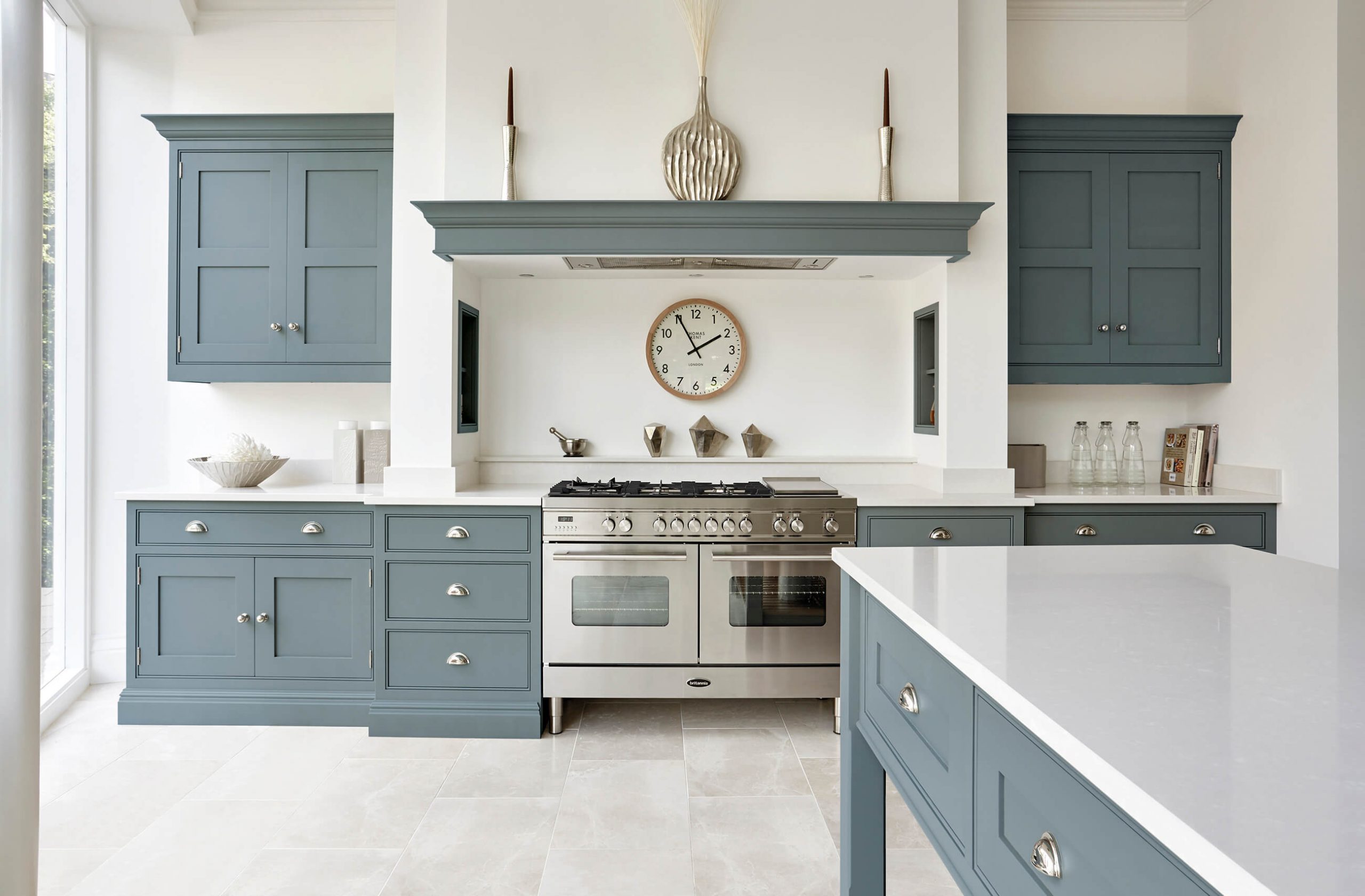
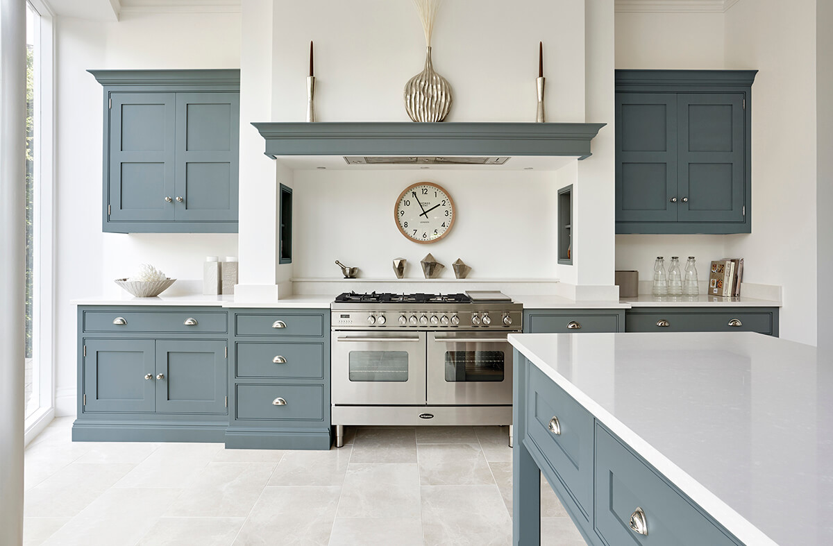
When choosing a kitchen colour, it’s just a matter of discovering what excites you. Blue continues to be a popular choice for kitchen cabinetry thanks to its organic allure and fresh, easy-to-live-with look. Azurite is our latest beautiful blue to be added to our palette. This nostalgic, bold hue can create a strong visual impact, especially in contrast with dramatic Caesarstone Empira Black worktops and matt black hardware seen here in our classic Hartford Kitchen.
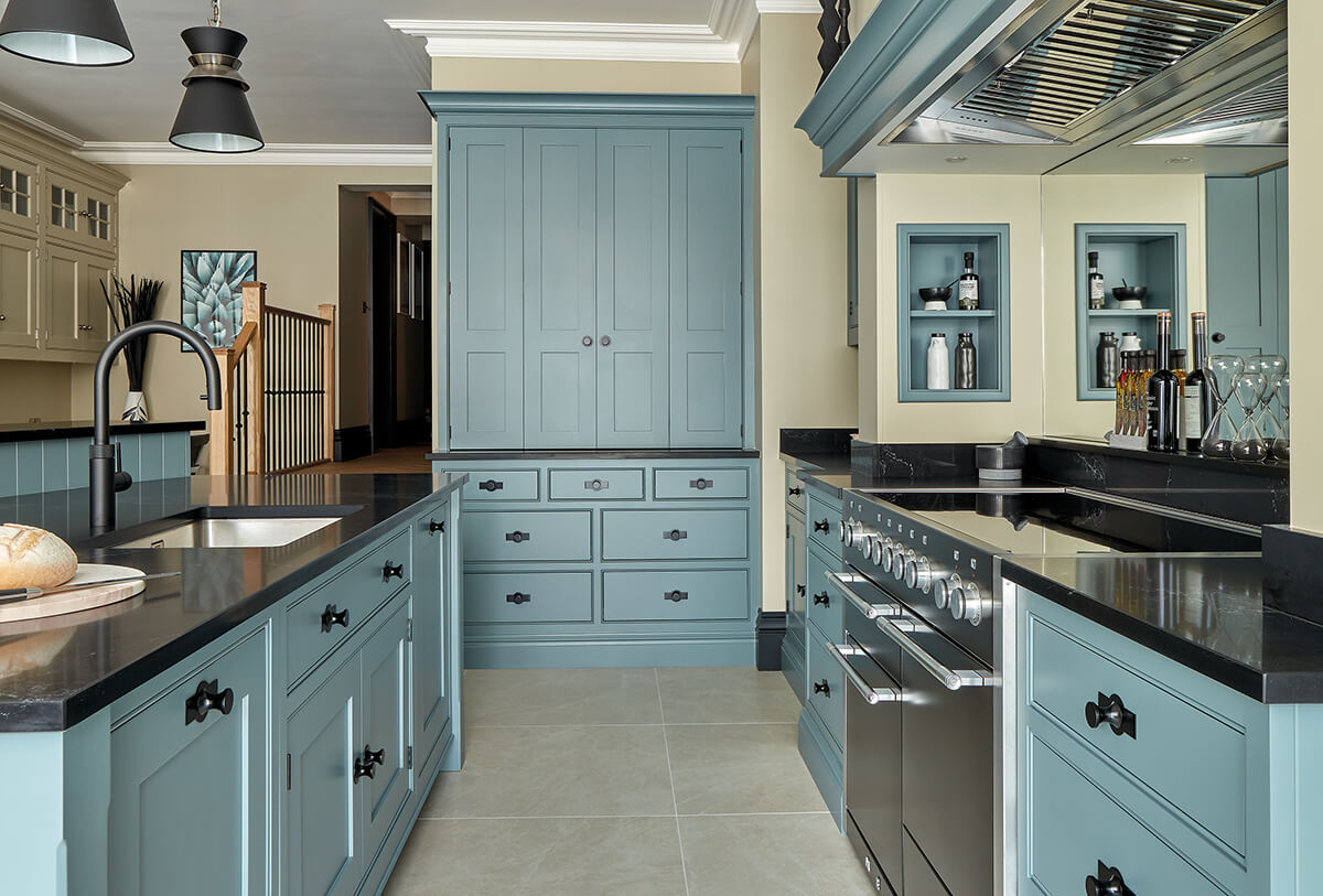
Azurite, Inky Sky and Opal, our latest blue paint colours, have a tremendous depth of colour, boasting grey, green undertones stopping them from feeling too cold. When using any of these blues, you can either go contemporary with black accents and high shine surfaces or opt for a more classic organic scheme with warm wood internals, milky white quartz work surfaces and brass or polished nickel hardware.
With bold colour now materialising in kitchen design, using a two-toned palette enables you to add a bright shade without overwhelming the space. A great way to add the two-toned look is to combine your favourite white or neutral with a contrasting island or base unit colour.
In a recent Homes & Gardens feature Design Director, Tom Howley explains, ‘White is a classical kitchen choice that works well on its own but can prove even better when used in a two-tone scheme. Bright white is a great choice for creating crisp contrasts that will freshen and lift earthy greens.’
If you’re into brave design choices, then bold colour contrasts in the kitchen are a must. If you’re unsure of what colours to choose, maybe take inspiration from your favourite fabric or piece of artwork hanging in your home. High impact combinations such as our colours, Serpentine and Pink Dusk, are perfect for adding a new dimension to the kitchen. Do remember although you want these daring colour pairings to be visually striking, you still need to consider balance and choose a palette that will appeal to your tastes in the long run.
Don’t be afraid to use large areas of colour in your kitchen. The kitchen is no longer just a functional space; it’s the hub of the home, so you can afford to be as playful and bold as you like. Try moving away from multiple shades and focus on one key colour that will work to give consistency and amplify the design. Think about what look you want to go for. Do you want to create a unique sanctuary or a kitchen with calming qualities using refreshing shades? Both walls and cabinetry painted in the same colour can simplify your scheme and make your room feel more spacious.
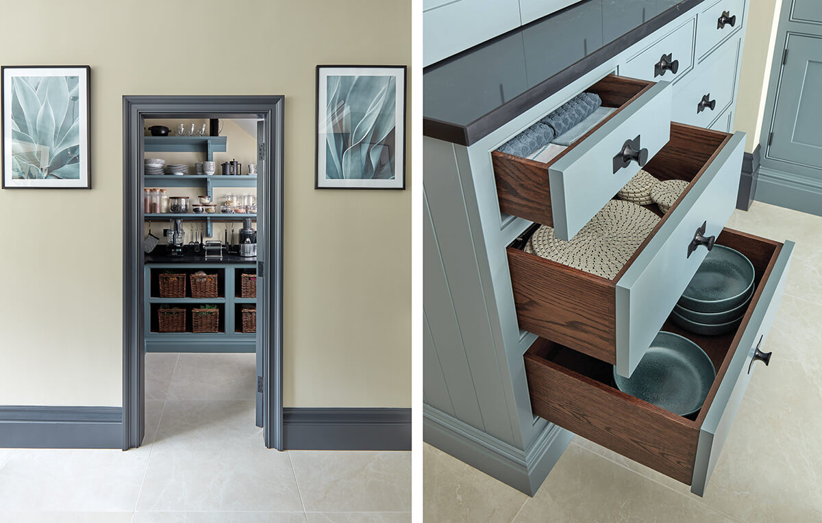
If you’re not one for all over colour but still want to add depth and personality to your kitchen, cherry-picking a colour for your cabinet internals can accomplish brilliant results. Choose a colour for your kitchen internals or open shelving that matches your walls for continuity in the space. Add a more delicate accent shade to the back of glazed cabinets or a kitchen niche for something a little softer.
The natural light in your room changes throughout the day and at night when walls and cabinetry are often lit by artificial light. This can have an impact on the look and feel of your chosen colour. The best way to see if your preferred shade looks good 24/7 is to place your colour samples and see how it looks in daylight and after dark. Tranquil blue and green hues are fantastic in places with lots of warm sunlight. If you have a room with harsh light or want to create a cosy atmosphere, choose warm neutrals, colours with yellow undertones or dark navy blues.
When choosing a colour for your kitchen, you must maintain a sense of balance and flow. Understand what mood you want to evoke and work out whether the colour you choose resonates with you.
We recommend choosing colours that complement the existing style of your home. You don’t need to be too precise with this, but making sure there’s some continuity throughout will help rooms feel more connected. Rather than one solid colour, it’s best to use slightly different tones to create a dynamic scheme from one room to the next.
If you’re worried about the longevity of choosing a bright paint colour, then the base notes of our colour palette are a great place to start. Our timeless neutrals give you the freedom to explore other creative design elements in your space, such as statement splashbacks, playful lighting and stylish accessories. You can also add depth and texture through wooden finishes, natural stone flooring and high shine quartz work surfaces.
Learn more about our colourful kitchens and explore them in a new light in one of our eighteen nationwide showrooms. Find your nearest here or request a free brochure today.