Back to Blog
Follow us


Pink has long carried strong associations, but in today’s interiors landscape, it’s beginning to take on a new role. Whether as a playful bold statement, or an intentional, broad-brush decision, pink kitchens are having their moment.
As homeowners move less and stay in their properties for longer, we’re seeing the world of interiors change as people let go of expectations of resale value, instead renovating with their own enjoyment in mind. As a result, confidence in colour is growing as we watch people move away from rigid neutrals like white and grey and gravitate towards warmer, more characterful palettes.
While it’s not the most popular colour for kitchens – that accolade belongs to green, which is the most requested cabinetry colour according to 76% of designers surveyed by the National Kitchen and Bath Association (NKBA) – pink is growing in popularity. As a versatile, mood‑shaping tone that brings softness and warmth to homes, and an alternative to the idea of a “safe kitchen”, pink is finding its place.
While it’s not everyone’s cup of tea, pink kitchens’ popularity is growing, with a spike in Google search volumes for people looking for pink kitchens online in early 2026 and endless articles on pink home interiors appearing in every home publication. Pinterest searches for terms such as ‘pink kitchen ideas’ and ‘pink kitchen aesthetic’ have also shown consistent growth over the past few years.
We’re observing a broader shift towards people rejecting full neutral colour schemes and feeling more experimental with colour, and this is happening across the colour spectrum – including with pink.
Tom Howley designer Connie Sharp says, “I always advise people to go with colours they like and not to go with the trend of the moment. Most people still have the same favourite colour they had when they were little, so it’s unlikely to change.”
As colourful interiors feel less risky and more accessible, those long‑held favourites are beginning to appear in homes all over the country. In 2015, data from YouGov found that pink is the favourite colour of around 6% of people in the UK – if we scale that up to the whole of the UK population, that’s around 4 million people!
Homeowners are staying put for longer, with homeowners living in their properties for an average of 10 years, compared to only 8.25 years in the early 2010s. This means many people are choosing to renovate for themselves and the things that bring them joy, rather than purely for resale. This means that people who love pink – and likely have always loved it – now have the outlet and inspiration to make a pink kitchen a reality!
Colour psychology is a fundamental pillar of home design, and something our designers at Tom Howley are very familiar with. While colour is subjective, certain colours are known have an impact on our mood and emotions, changing how we feel in a certain space.
Bars, shops, restaurants, and hotels all do this to make us feel a certain way when we’re spending time there – it’s why yellow discount stickers are yellow, and why most big sale signage is red.
While individual responses to different colours is shaped by a lifetime of personal and cultural nuances, we can use colour psychology at home to create spaces that make us more likely to feel a certain way.
Pink is becoming increasingly popular in kitchen design because it makes us feel calm, particularly in lighter, and more muted shades. It’s non-threatening and nurturing. In fact, a specific shade of pink called Baker Miller pink (although sometimes referred to as Drunk-Tank Pink!), has been used in prisons, military bases, and sports locker rooms for its supposed ability to suppress anxiety-triggered antagonistic behaviours and reduce aggression and hostility. While no-one wants their home to feel like a prison, we can take these findings and apply them to warmer, softer pink tones that are better suited to the home, for creating calm without evoking correctional facility.
Kitchens can be chaotic, but they don’t have to be. Soft pink tones help to magnify calm and reduce stress, so that being in your kitchen is an experience that lifts you up instead of pulling you down.
The broad spectrum of pink tones means many can be used as a light, soft neutral or a bridging shade for bolder tones. Plaster pink is already a shade that we see naturally in construction, which brings a stripped back, calming, organic feel when these light warm-pink tones are used in the home.
Cooler neutrals like greys and ice white have been declining in popularity for around a decade now, with people wanting new, fresh, and warm tones to fill the gap. That’s exactly what light pink tones like Pink Salt do.
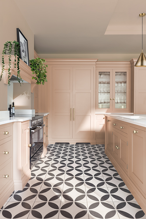
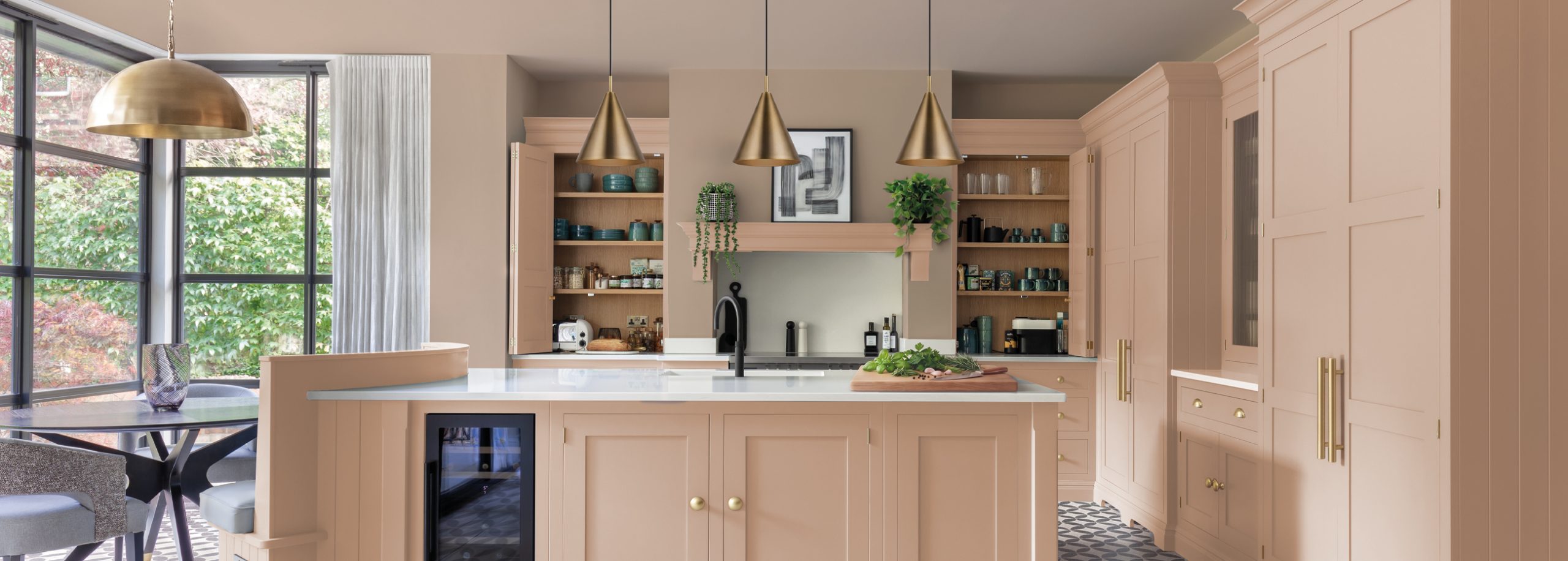
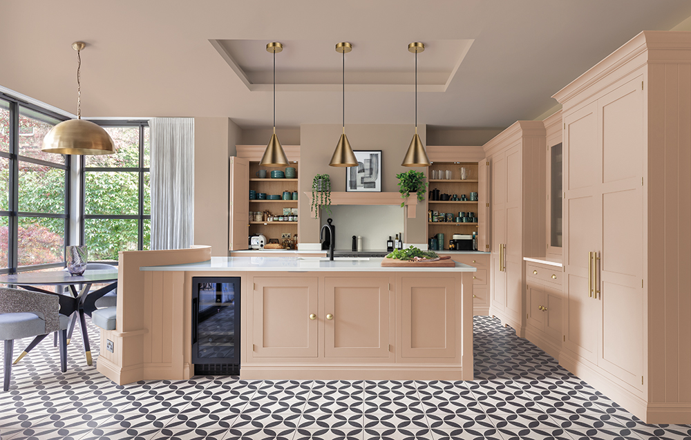
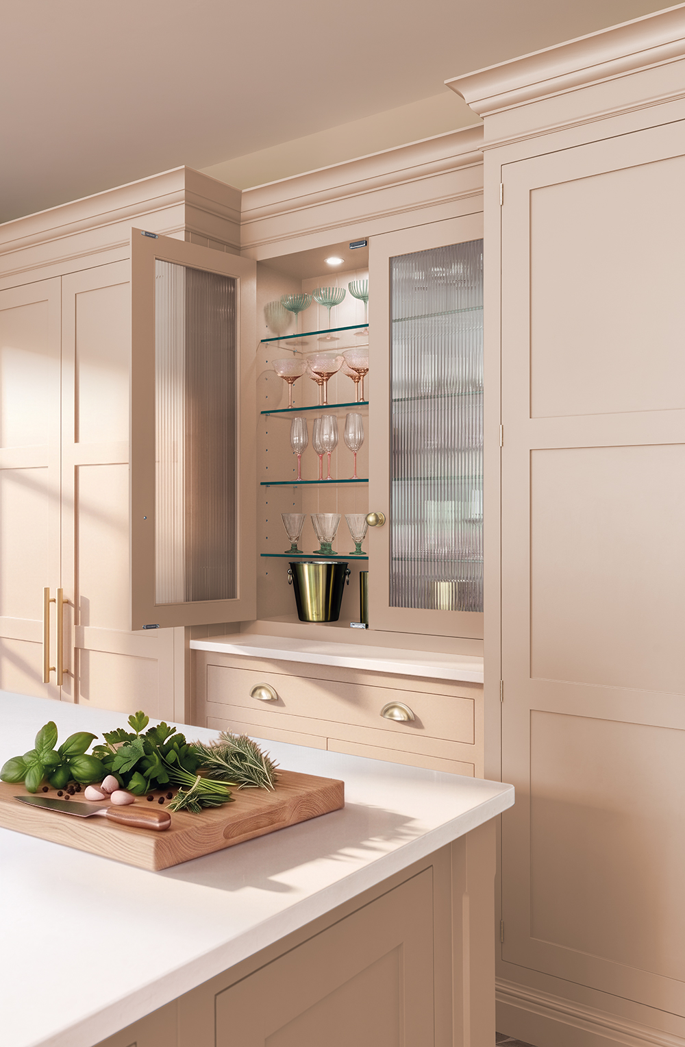
Pink Salt has been developed to fill exactly this space in the Tom Howley colour collection – it’s a warm-toned, lightly saturated pink that catches the light to create that calm and stillness without fading into the background.
When developing a pink for the Tom Howley palette, the intention was clear from the outset – a colour that could be used in a variety of ways and had personality without overwhelming a kitchen space. The aim was to create a “stepping stone” of colour, confident enough to stand alone, yet equally comfortable as a bridging shade alongside deeper tones such as Sea Smoke, Sloeberry, Sumac or Hazlewood., to name just a few.
“Pink Salt is a lovely and bright shade which feels really liveable. Even people who are on the fence or a little hesitant about colour can often feel braver once they’ve experienced it in person in a showroom. Seeing those large displays in person really helps them visualise how colour would work in their home.” – Lucy Nash, Tom Howley Designer
Pink kitchens are no longer about novelty. They are about choosing a space that prioritises calm, that feels warm and personal. Pink Salt sits in the Tom Howley colour palette alongside 3 other shades designed to help our clients escape the ‘safe’ kitchen and create a room that sparks real joy.
Discover our spring colour launch here, or get in touch to visit your local showroom and speak to a Tom Howley designer.