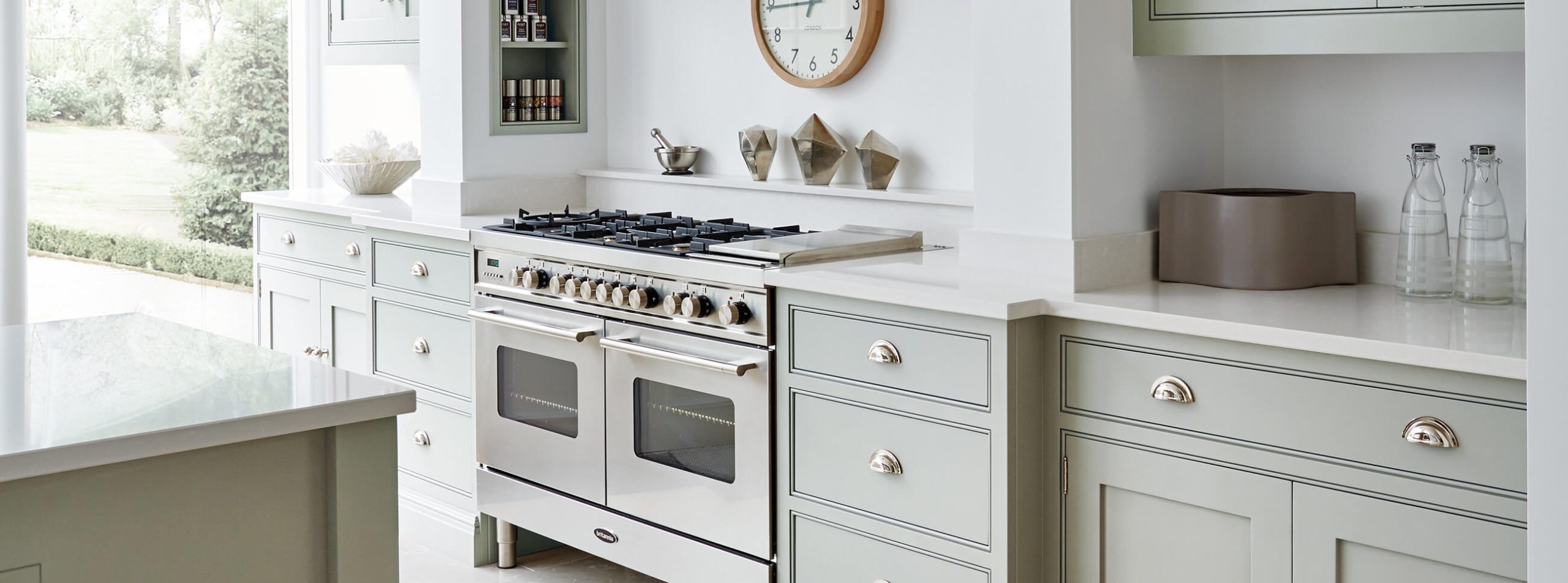

While the fundamental principles of Tom Howley kitchens remain consistent, we continually seek fresh avenues to invigorate our designs with innovative new features, finishes, and paint colours.
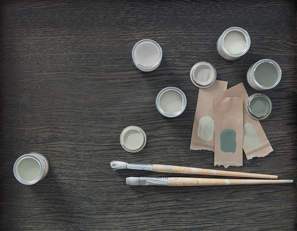
Green is a colour that has sat at the pinnacle of colour trends for many seasons and is set to remain popular with its fresh and enduring appeal. We already have two beautiful greens in our colour palette, Avocado and Moonstone; however, this winter, we are adding two new interpretations of this popular shade to our collection. Green Meadow, a classic heritage green, and Hazy Sky, a subtle green/grey blend, are both crafted to infuse the kitchen with a tranquil ambiance, transforming any space into an inviting environment you’ll relish spending time in.
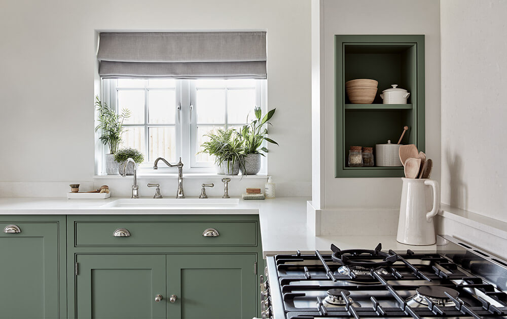
Green kitchens are having something of a moment. As a colour we associate primarily with nature, this grounding shade has an incredible way of reconnecting us with our surroundings, creating moments of calm and positivity.”
Creative Design Director, Tom Howley.
Amid a world that often encourages conformity to the latest interior trends, there’s a unique beauty in paving our own path, especially in the realm of kitchen design. The introduction of new paint colours to our palette unfolds organically. While we take note of trends and broader industry insights, the colours we choose consistently exude a timeless quality, embodying the classic Tom Howley aesthetic. Drawing inspiration from the colours of nature, each of our paint shades is inherently connected to botanical or earthy references, a testament to the perpetual influence of the natural world within interior design.
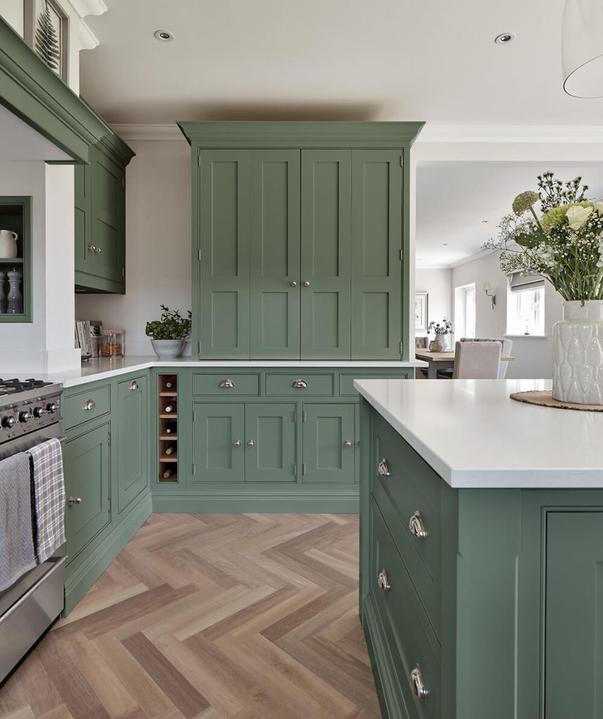
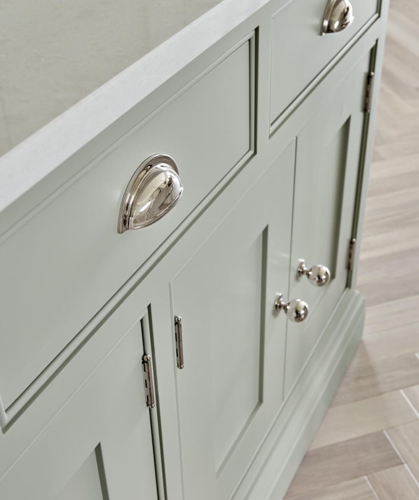
The selection of colour plays a pivotal role in the triumph of your kitchen design. When chosen thoughtfully, a room will stand the test of time, so we spend hours ensuring each shade introduced complements elements of our kitchen collections and our diverse palette of colours.
Homeowners are venturing into new ideas and embracing colour in unprecedented ways, making it the opportune moment to introduce two unique hues into our palette.
Creative Design Director, Tom Howley.
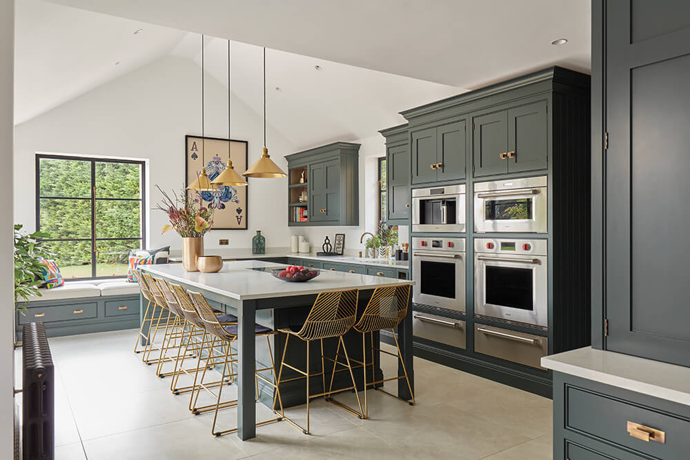
Meet Green Meadow, our latest addition to the spectrum of muted and natural greens. Nestled in the mid-range of our green colour palette, this smoky green-blue paint exudes a cosy ambience.
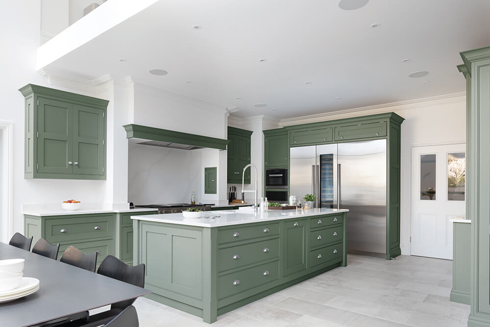
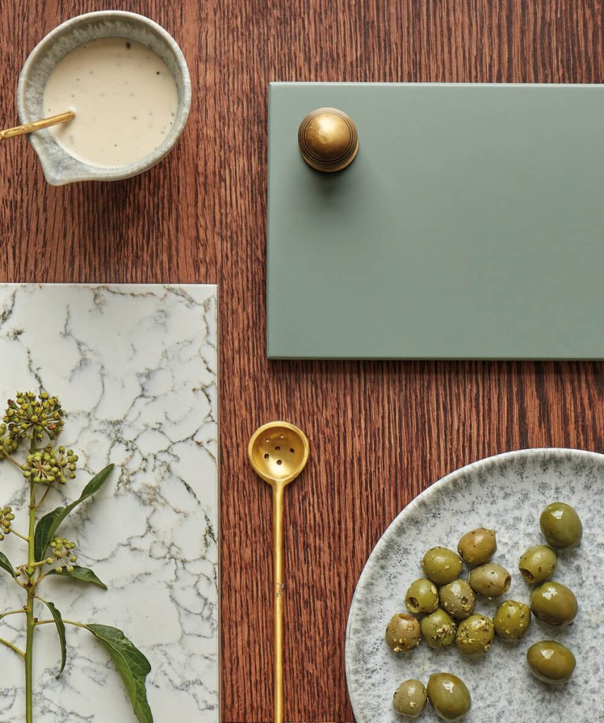
Its versatility and subdued character make it ideal for infusing a hint of colour into the kitchen without overwhelming the space. Through our explorations, we’ve discovered that it effortlessly complements natural wood tones, marble effect quartz, and brushed metallics such as burnished brass or satin nickel handles, adding a touch of elegance to your kitchen design.
Styling tip: Enhance the allure of our new green kitchen paint colour, Green Meadow, by incorporating natural rustic elements and textured fabrics into your space. You can also introduce the vibrant energy of plants and flowers, creating a refreshing connection with the outdoors.
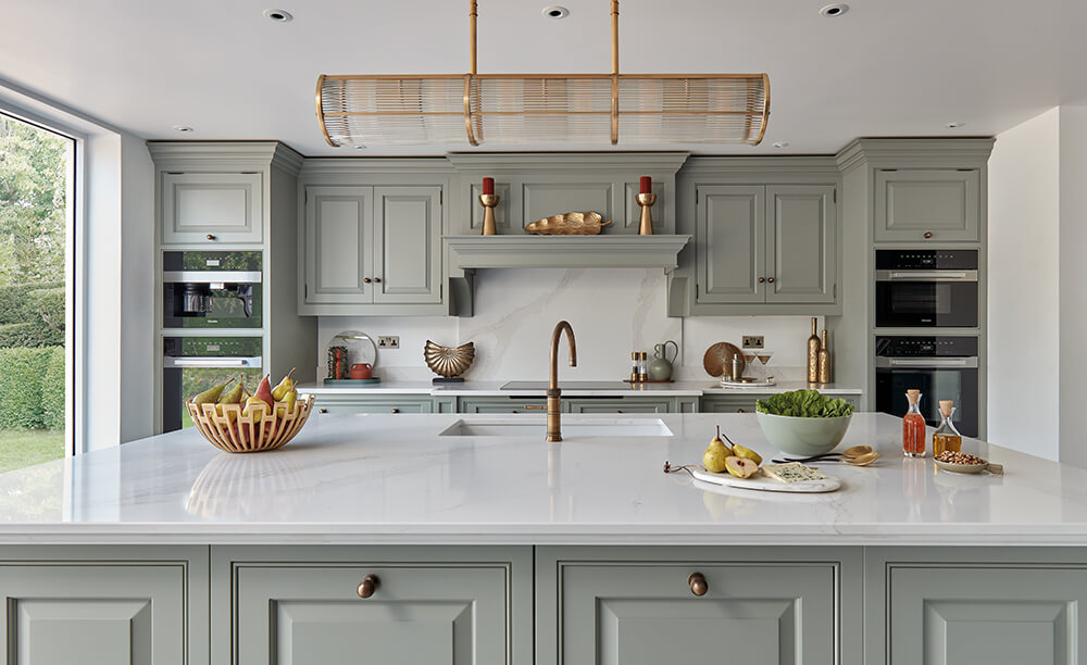
Introducing Hazy Sky, this soft green-grey shade brings tranquillity to the heart of your home. Its unexpected sage undertone radiates a sense of calm, making it an ideal choice for those seeking a serene kitchen atmosphere. Tom Howley notes, “Looking ahead to 2024, we see the rise of mid-shade neutrals inspired by the hues of the sky and misty landscapes. Here’s where Hazy Sky comes in. This soft pastel captures the peaceful essence of a misty, atmospheric sky, offering a soothing touch to a culinary space.”
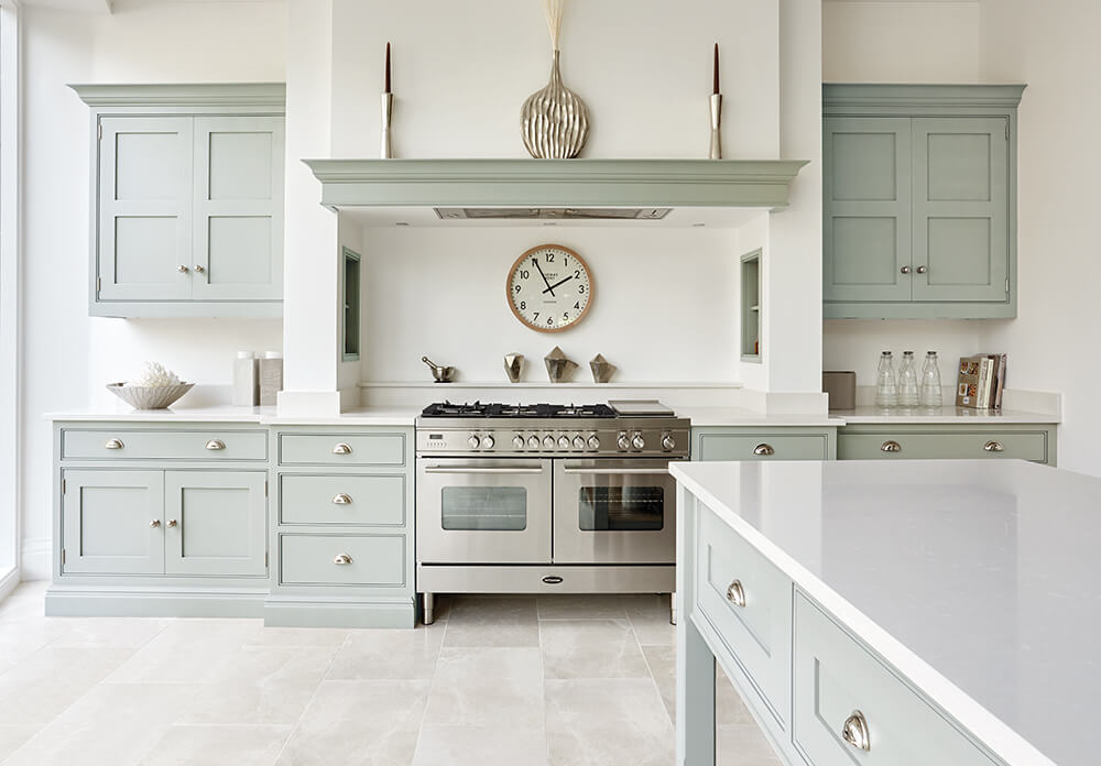
Like its counterpart, Green Meadow, Hazy Sky embraces versatility, making it an excellent choice for multifunctional kitchen and living spaces. Whether you envelop the entire room in this soft green hue or create a perfect blend with other light neutrals within our palette, this captivating colour will surely bring a smile to your face.
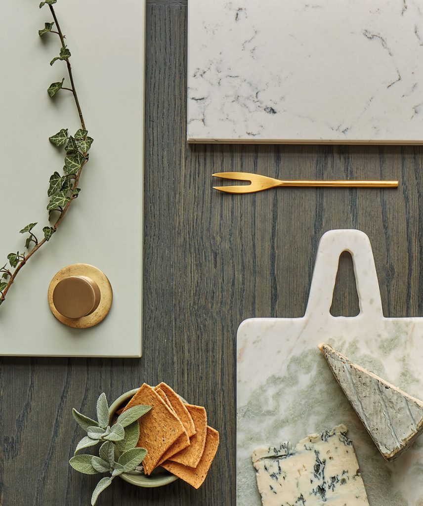
Styling Tip: To amplify the understated charm of Hazy Sky, pair the colour with warm woods, gold-toned metallics, and surfaces boasting bold veining. This sophisticated combination creates a delightful interplay of textures, delicate contrasts, and a hint of luxury that allows Hazy Sky to shine.
Green is one of the most versatile and beloved colours for home decor, yet achieving the perfect balance is a delicate art. Too much green can result in an overly vibrant or overwhelming aura, while an excessively intense shade may create a distracting and harsh environment. To harmonise the green in your kitchen, consider incorporating a complementary second colour from our palette.
Pairing greens with neutrals creates a timeless and calming ambience, where the subtle elegance of neutral tones, such as soft greys, creams, or warm beiges, complements the vibrancy of the green, striking a perfect equilibrium. A two-toned palette within the green spectrum can work wonders for those seeking a nuanced touch. Mixing shades of green, ranging from deep emeralds to muted sage, creates a monochromatic scheme that brings depth and sophistication, layering interest throughout your living spaces.
Green can become a key player in crafting a warm and inviting kitchen. Deeper saturated greens such as Green Meadow or Avocado can create cosiness and intimacy, enveloping your space in a soothing ambience. However, it’s crucial to consider the room’s orientation. Fresh, vibrant greens may exude a cool atmosphere, making them ideal for south-facing rooms basking in ample sunlight. In contrast, avoiding these cooler tones in north-facing rooms is advisable, opting instead for warmer greens to counterbalance potential chilliness and infuse the space with a welcoming glow.
As we introduce our latest paint colours, we’ve turned to interior experts to provide valuable insights into the growing popularity of green.
Interior Designer, Naomi Astley Clarke, emphasises the everlasting appeal of paying homage to the outdoors, stating, “Paying tribute to the glorious outdoors never goes out of style. As a colour we associate primarily with nature, green helps connect us to our surroundings which promotes positivity and calm. Ultimately, it’s a hue that symbolises growth and renewal, and in psychology, it’s associated with feelings of balance, harmony, and security.”
“I always view green as a neutral and embrace the garden as an extension of the home. The lush colour works beautifully against bold, black-and-white patterned cushions and with sleek marbles, warm woods, and shiny brass. You also can’t go wrong with pairing green joinery and crisp white walls as the earthiness of the green contrasts and grounds the airy, lightness of the white. This creates a space that’s fresh at the same time as being cosy.”
Delving into the psychological impact of green in the home, Interior Designer, Matthew Williamson notes, “Green has a calming and mood-enhancing effect and, conveniently, I think it’s also one of the easiest colours to decorate with. The choices when using green in the home are so varied and seemingly endless, yet just as in nature, they all seem to sit in perfect harmony when used together. Wherever I live, I use green liberally, as I know my sense of well-being will be all the better for it.”
Discover more about our colour options and experience them in a new context at any of our twenty showrooms. Locate the nearest Tom Howley showroom or request a free brochure today.