Back to Blog
Follow us


It’s to no surprise that 2020 has changed our relationship with our homes. We’ve begun to explore ideas and embrace colour in a way that we never considered before. We crave comfort, newness and schemes that promote positivity, especially in the heart of the home. Explore our Tom Howley kitchen paint colours and discover some of our favourite ways to use our daring new shades below.
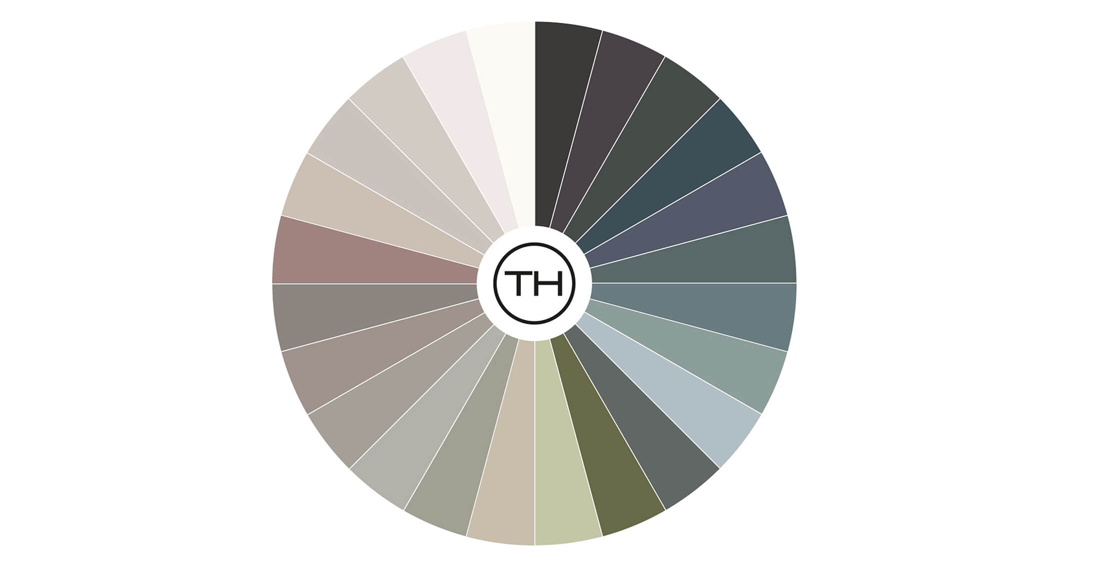
Each of our carefully chosen colours has been developed for our kitchen collections. Simple yet beautifully curated, our 24 paint colours consist of whites, darks, traditional neutrals and a small selection of distinctive new shades for those who crave something a little different. We spend hours ensuring our kitchen paint colours work in harmony with each other, you can mix and match colours until you find the perfect palette to suit you and your home.
When it comes to introducing new paint colours to our palette, they often develop organically. We still acknowledge trends and broader industry insights but ultimately the colours we choose always have a timeless quality achieving that classic Tom Howley look. Nature’s colours are continually inspiring us, so naturally, all of our paint colours have a botanical or earthy point of reference.
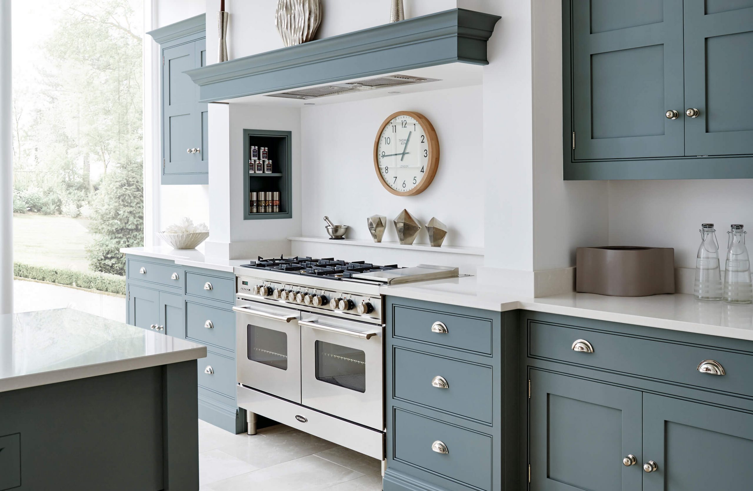
Contextualising these colours helps to inform our clients’ choice. Without its botanical reference, a blue island counter is just a blue island counter. Instead, we named our most popular blue, Lithodora – the electric blue of the beautiful garden flowers.
Design Director, Tom Howley.
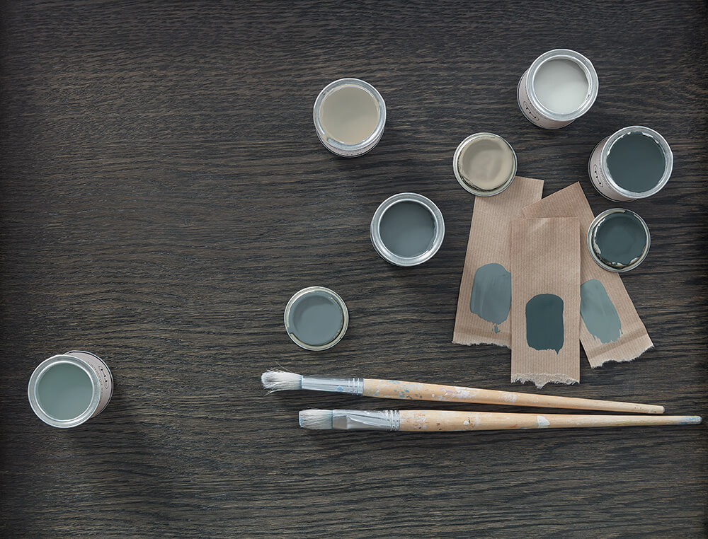
We’ve recently introduced a selection of new paint colours that are bound to fill your colour cravings. We have three beautiful blues, Inky Sky, Opal and Azurite. Also in the palette are two down to earth greens, Aloe Vera and Serpentine, a new neutral called Oyster, Pink Dusk which is a muted rose and a stylish deep aubergine called Stormy Sky.
Chosen correctly a colour will stand the test of time, which is why we spend hours ensuring each shade selected, complements every element of your kitchen design. With the introduction of our new colours, we thought we’d share some of our favourite ways to use colour in the kitchen.
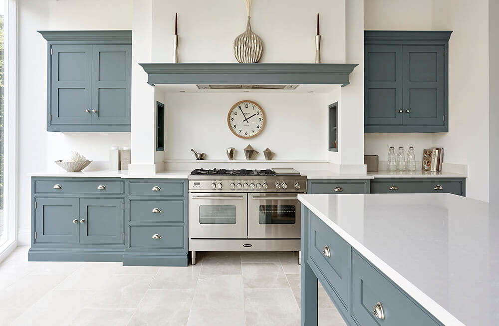
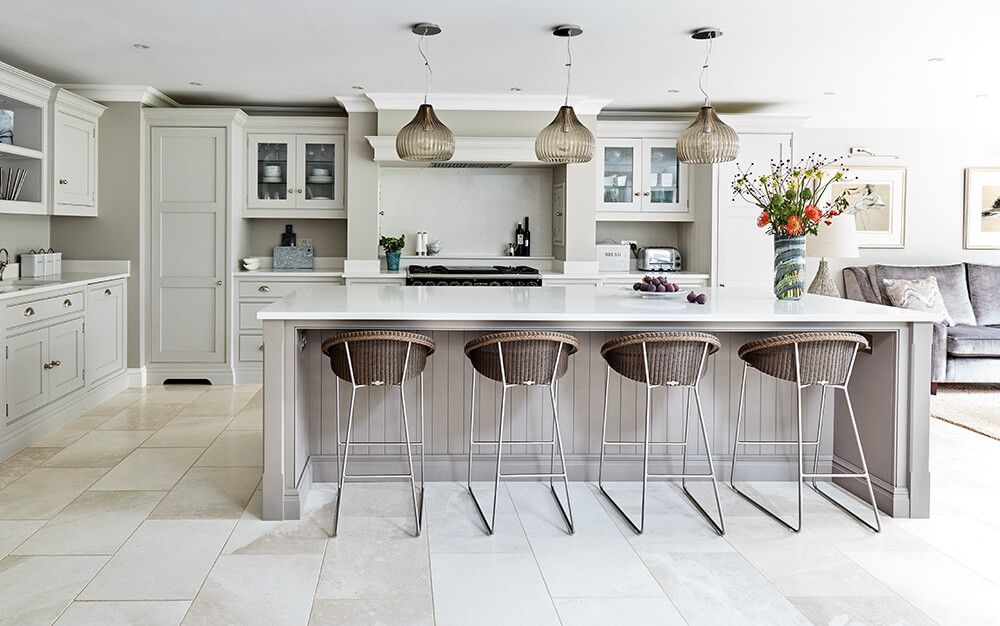
Don’t be afraid to use large areas of colour in your kitchen. Move away from multiple shades and focus on one key colour that will work to give your consistency and amplify the design. Think about what look you want to go for, do you want to create a dark cosy sanctuary or a kitchen with calming qualities using gentle, refreshing shades? Both walls and cabinetry painted in the same colour can simplify your scheme and actually make your room feel more spacious.
When it comes to creating a serine grounded look then our new paint colour Azurite is an attractive choice. Although darker shades of blue are growing in popularity, nostalgic hues such as Azurite can create a strong visual impact, especially contrast with warm woods and soft whites. All three of our new blue kitchen paint colours have a tremendous depth of colour boasting grey, green undertones stopping them from feeling too cold, perfect for kitchen cabinetry.
Whether you love Scandinavian design or rich nostalgic aesthetics, it’s just a matter of discovering what really excites you. Bold colours aside, you can still create depth and personality in your kitchen with calming neutrals. The base notes of our colour palette are a great place to start when choosing a scheme that reflects your lifestyle. These grounding shades also give you the freedom to explore other creative design elements in your space such as statement splashbacks, playful lighting and stylish accessories.
Our timeless neutrals are susceptible to change, depending on the light available. We consider where natural light is coming from and how task lighting will create varying shades. Use lighting to your advantage and choose a combination of colours that look fresh in the day but warm and inviting at night. If you’re considering bright white, you should balance it with warmer shades on walls or the island to ensure your room doesn’t feel clinical and sparse.
Soft shades of grey, warm whites and earthy beige work well on their own but even better when used in a two-tone scheme. Two of our most loved shades are Tansy and Willow, beautifully understated they create truly stunning kitchens enhancing architectural interest, all without the need for bold colour. If you’re using lighter colours to enhance your space then try painting your walls in the same shade, this will focus your eye on the whole area, allowing it to feel larger and lighter.
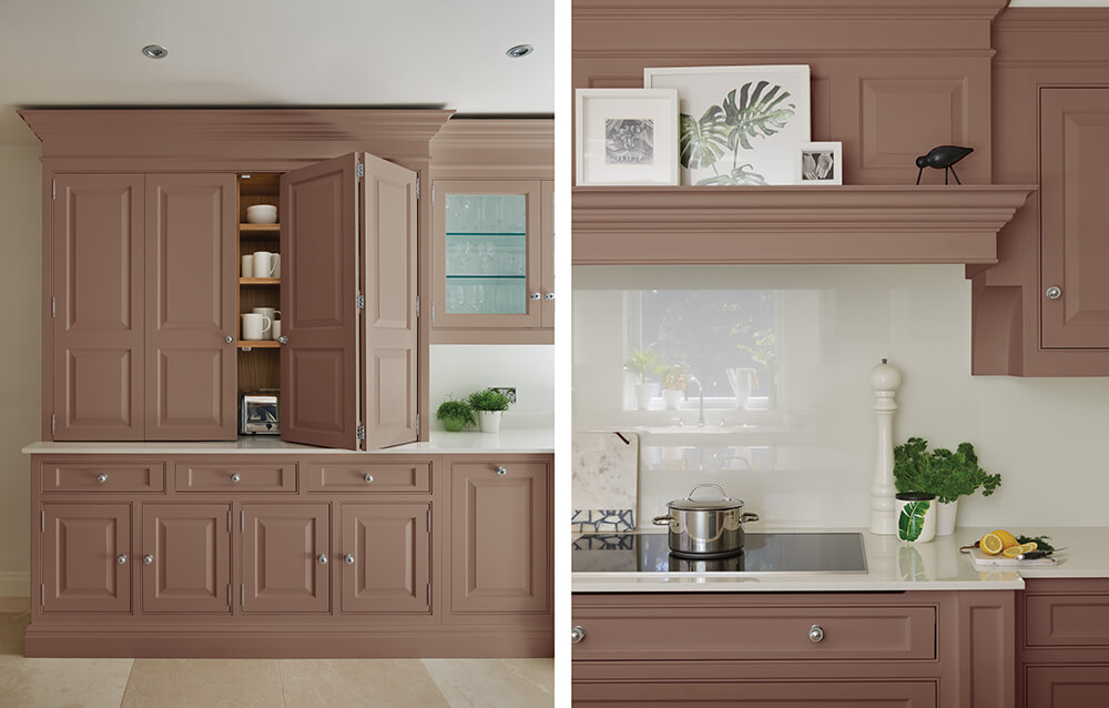
Colour sets the tone of a space, it tells a story and provides an environment to feel at home in. Our brave new paint colour Pink Dusk is perfectly suited for our timeless designs. An elegant, more playful alternative to grey it creates incredible warmth and an alluring appeal to a kitchen. Pink may divide opinion; however, over the past few years, this versatile shade has boomed in popularity. Pink Dusk is not like your usual bubblegum pink, It’s incredibly soft, charming and moody. You can use this colour across a full kitchen design or pair it back with complementary tones opting for a pink island.
Design tip: Lift pinks with sleek bright quartz worktops and add creative flair with brass handles and tapware for a bold but sophisticated look.
Dark and dramatic paint colours have a way of adding ambience and sophistication to a space. With trend experts, such as WGSN predicting dark kitchens are set to soar, it’s to no surprise that our paint colour Nightshade is becoming one of the most popular choices moving into 2021. Dark shades can come across as intimidating; however, it’s in the way you use them that changes the feel. Used on the main run of base and wall cabinetry dark colours can look luxurious and courageous while still having a timeless, intimate appeal. If you’re not feeling as brave, then combine dark paint shades with a green accent such as Moonstone or a classic neutral like Tansy for a balanced look that still has an impact.
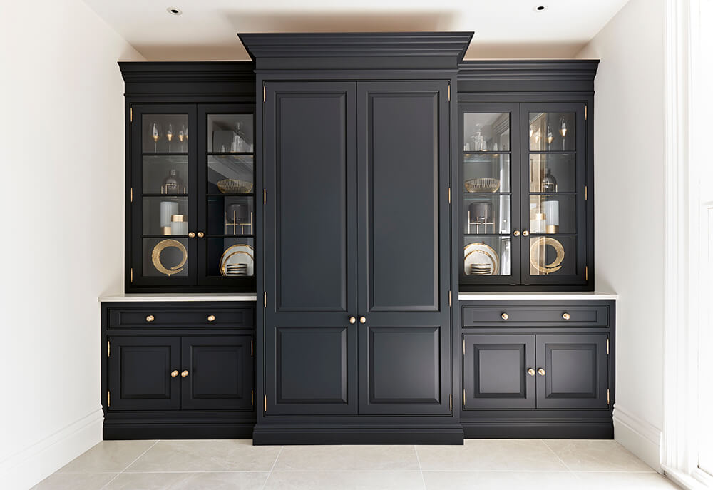
Some pairings never date. This Devine pantry has been painted in Nightshade finished with our gold handles, adding an abundance of warmth and character to the design. Flooring can also be a significant influencing factor in how well a dark paint colour works in your kitchen. As our Nightshade paint colour has warm charcoal qualities, it works wonderfully with light natural floor tiles and soft oak flooring, creating an overall smart yet distinctive look.
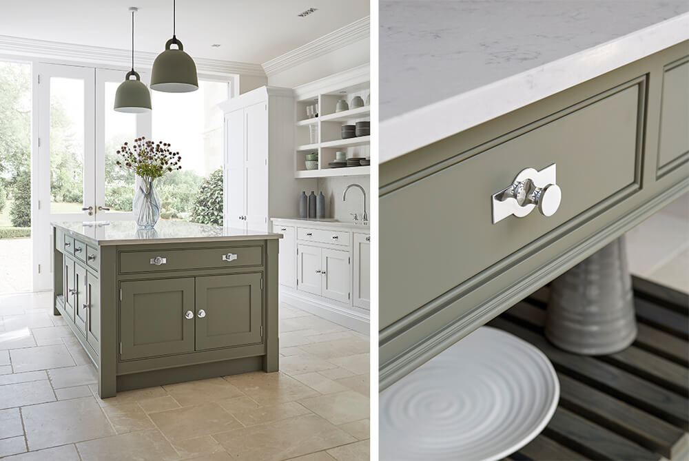
You don’t have to use a combination of white and grey to achieve a contemporary yet ageless look. With our stylish green kitchen paint colours, you can achieve the same feeling of openness and simplicity. Sage and olive shades are hugely on trend at the moment as we seek to improve our daily well being. They are ideal middle ground colours that can be used as an accent or full scheme.
Moonstone has a soft green quality that can work in both traditional and contemporary homes. When combined with neutrals such as Orchid and Tansy, which are neither too warm nor too cool it can create a thoughtful restorative space perfect for busy kitchen living areas.
Design tip: When choosing a neutral, you need to consider what look and mood you want to achieve. Do you want a period feel with softer yellow notes, or something more contemporary with subtle grey tones?
As well as combining with neutrals and natural woods, sage paint colours can be offset with dark charcoal accessories or inky hues bringing a whole new edge to your space.
When you see a hand-painted kitchen, that’s been exquisitely finished by a craftsman, not a machine you can see the difference immediately – it’s all in its individual charm and superior quality. Learn more about our colours and explore them in a new light in one of our seventeen nationwide showrooms. Find your nearest here or request a free brochure today.