Back to Blog
Follow us


Award-winning interiors blogger and digital creative Melanie Lissack is known for her fearless use of colour and playful mix of design styles. “I’m a huge lover of colour within interiors and mixing and matching different decor styles within my home,” she says. In a recent conversation with us, Melanie reflects on our new paint colours, Hazelwood and Sumac, sharing how she builds moodboards, considers undertones, and introduces bold reds into her schemes with confidence.
Every design begins with a starting point. For Melanie, that inspiration often comes from something already in the room.
“I usually start with something that is going to be included in the room or already exists there. This could be a piece of art, a rug, or the architectural features of a space. I will often lift a colour or a shape found within these items as a starting point that will form the base of my design scheme.”
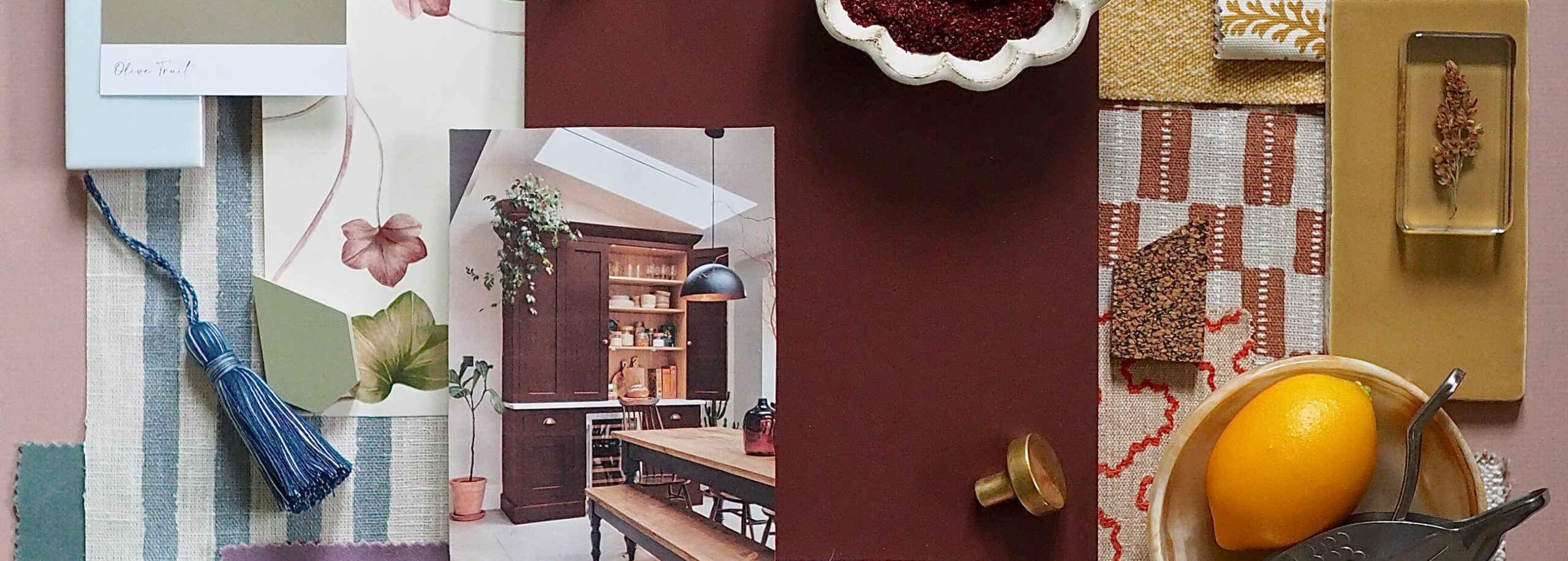
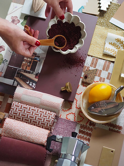
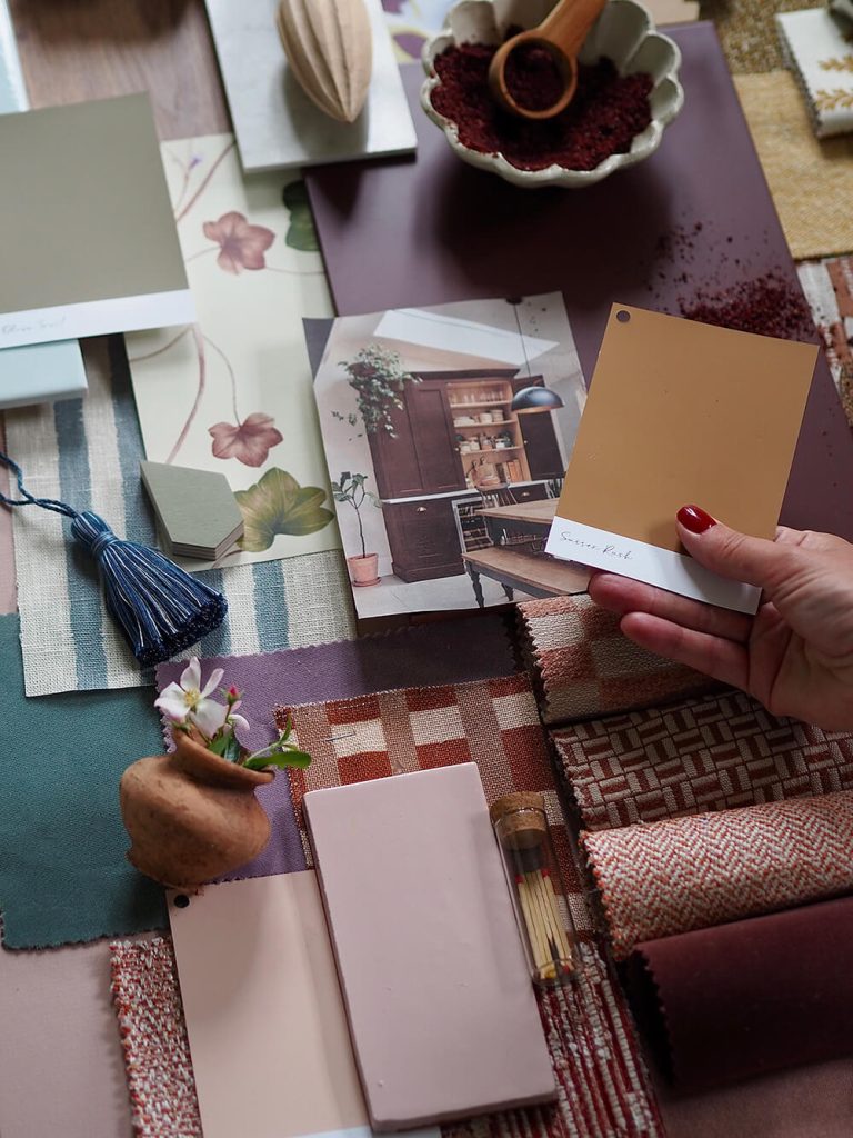
Once she has a foundation, the moodboard takes centre stage. “I will then move over to using a moodboard to build on my ideas because it’s such a helpful tool for getting a strong concept of what pairs well and works together. A moodboard is where I gain insight into what colours, textures, patterns, and finishes complement each other. It also serves to put a hold on making some expensive design mistakes!”
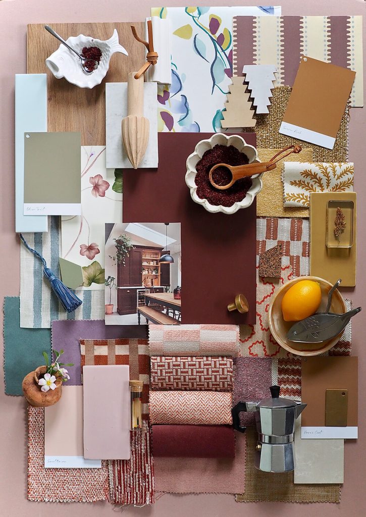
Unlike purely practical design boards, Melanie’s moodboards are tactile, layered, and full of personality. “On a physical moodboard, I will include many things that aren’t just paint swatches and fabric samples. A moodboard should also incorporate how the room will be styled, so I’ll add a few small decorative items and the odd floral stem.”
Her trick? Florals. “One of the best ways to discover what colours work well in a room is to rotate different floral combinations within the space. I might find that a soft pink or a strong yellow in the florals will elevate the room instantly, so I’ll transfer that over into adding a yellow cushion or a pink lampshade.”
Colour is never just decoration; it shapes how we feel. Melanie shares, “I think colour plays a large part when it comes to the feel of a space, but I also believe that colour is very personal. Neutral interiors can be perceived as cold and sterile by some, while others find them clean and calming. I think this is the same for more vivid shades: for some, they are joyful and inviting, while for others, strong colours can feel overpowering.”
Melanie is unapologetic about her love of strong reds, especially when applied in unexpected ways. “I’m a huge fan of a richly pigmented colour on the woodwork. I think it makes such a statement and looks so sophisticated. Painting doors, windows, skirting and kitchen cabinets a strong hue is so striking, and it means that you can leave the more expansive walls in a neutral tone as a backdrop.”
When it comes to pairings, she’s both classic and daring. “I absolutely love red and blue together. I’m also a fan of a more orange-based red with blue, which works equally as well. Red also pairs beautifully with soft blush pinks and toffee brown tones, which I think look really elegant together.”
Not every application has to be bold. Sometimes, a touch is enough. “There’s been a lot of focus on a pop of red in a room, and it really does work. A strong red or burgundy lamp, side table, sideboard or red painted doors will completely elevate a space.”
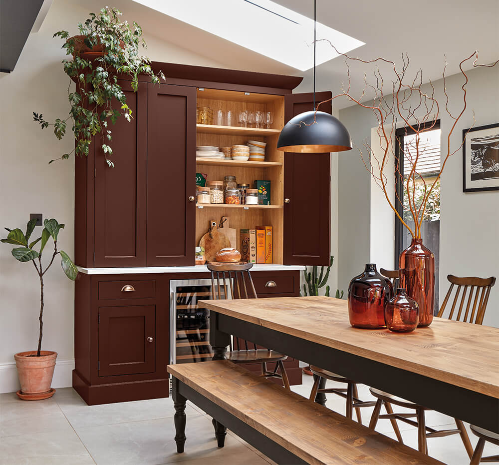
And while burgundy feels natural in autumn or winter, she insists red is a colour for all seasons. “Red is a great background colour where items in front of it pop, so a giant vase of sunflowers or natural greenery will lift the colour during spring or summer. For a more permanent fixture, pair red with honey-toned flooring or brass hardware.”
Her own sash windows tell the story. “In my bedroom, I painted my sash windows red. It was a bold choice, as I’ve never seen sash windows painted red before and my family were hesitant about my decision, but it really paid off. It adds so much visual interest to that room in a scheme that is mostly neutral.”
With shades such as striking as Sumac, Melanie believes the secret lies in introducing them slowly, one detail at a time. “I used to be scared of bold colour, but I started bringing it in slowly into my interiors via throws, cushions, rugs and art prints, until I gained the confidence to use more pigmented shades all over the walls. I’m also a huge fan of using tester pot paint in bolder colours to paint inexpensive picture frames and mounts. It’s an easy and small DIY that you can hang on your wall to bring in stronger hues to your decor scheme.”
Discover Melanie’s colour insights, alongside tips from other designer experts, in our Seasonal Colour Edit Lookbook—download your free copy here.
A special thank you to Melanie for sharing her inspiring ideas and images. To see more of her bold use of colour and creative styling, take a look at her Instagram: @melanielissackinteriors.