Back to Blog
Follow us


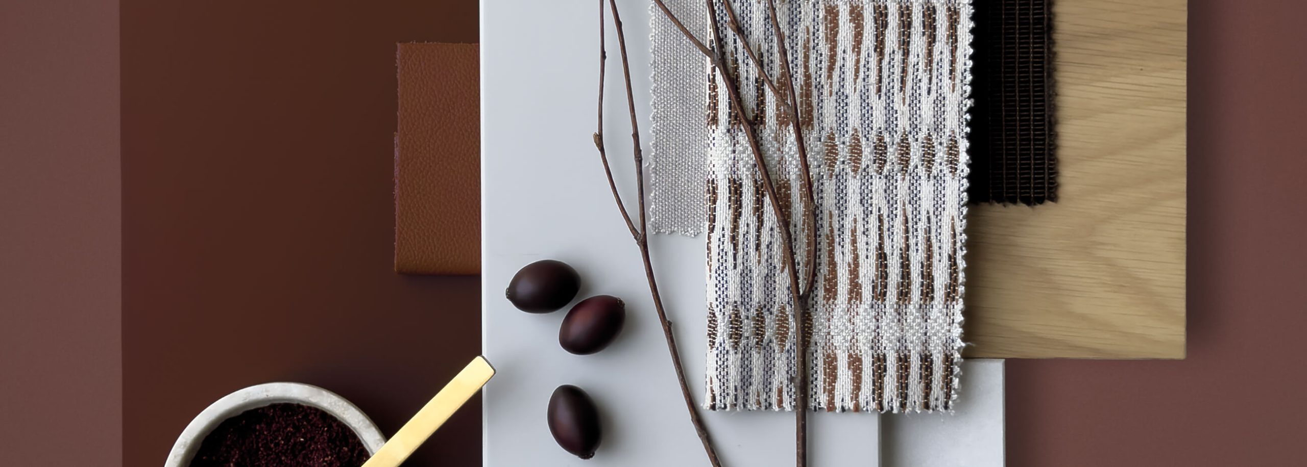
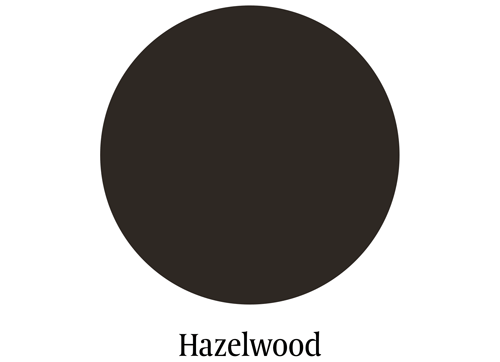
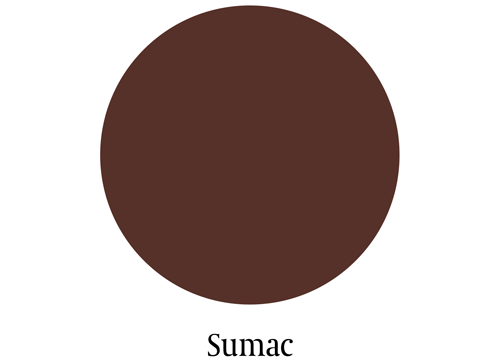
Every season brings a subtle shift in mood, atmosphere, and the way we experience home. Autumn is a season of retreat, where we gather indoors and savour the glow of light. It’s a time when kitchens once again become the heart of the home, filled with warmth, comfort, and reflection. This year, we’re delighted to welcome two new Tom Howley paint colours into the palette: Hazelwood and Sumac.
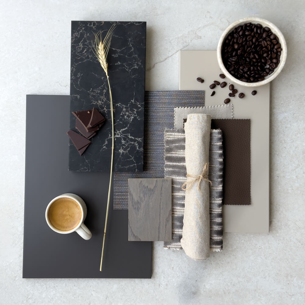
These colours were born from a desire to create something both bold and enduring. They are tones with substance, rich, earthy and deeply sophisticated, designed not just for today, but to feel timeless for years to come.
A colour choice should feel personal, but never fleeting. These tones create a statement without compromising on longevity, and they bring real character to our kitchen cabinetry.
Creative Design Director, Tom Howley
When we began exploring colours for the new season, we knew they needed to capture the essence of now, a time when people are more confident with colour, more expressive in making their kitchens feel lived-in and deeply personal.
Hazelwood and Sumac reflect this shift. They are warmer, cocooning shades that feel right for autumn and winter, yet they’re not bound by seasonality. Instead, they embody an enduring quality, working in kitchens year-round, whatever the light or the mood of the home.
They’re shades that mark the next chapter in elegant kitchen design, while still having the depth and refinement to stand the test of time.
Creative Design Director, Tom Howley
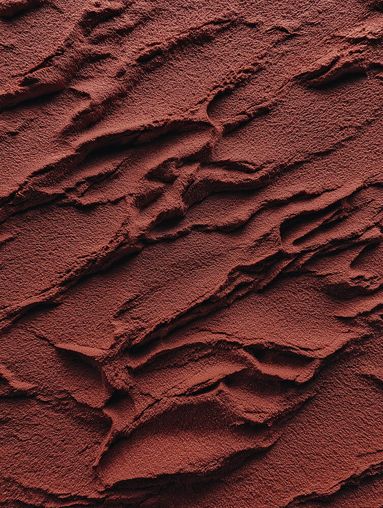
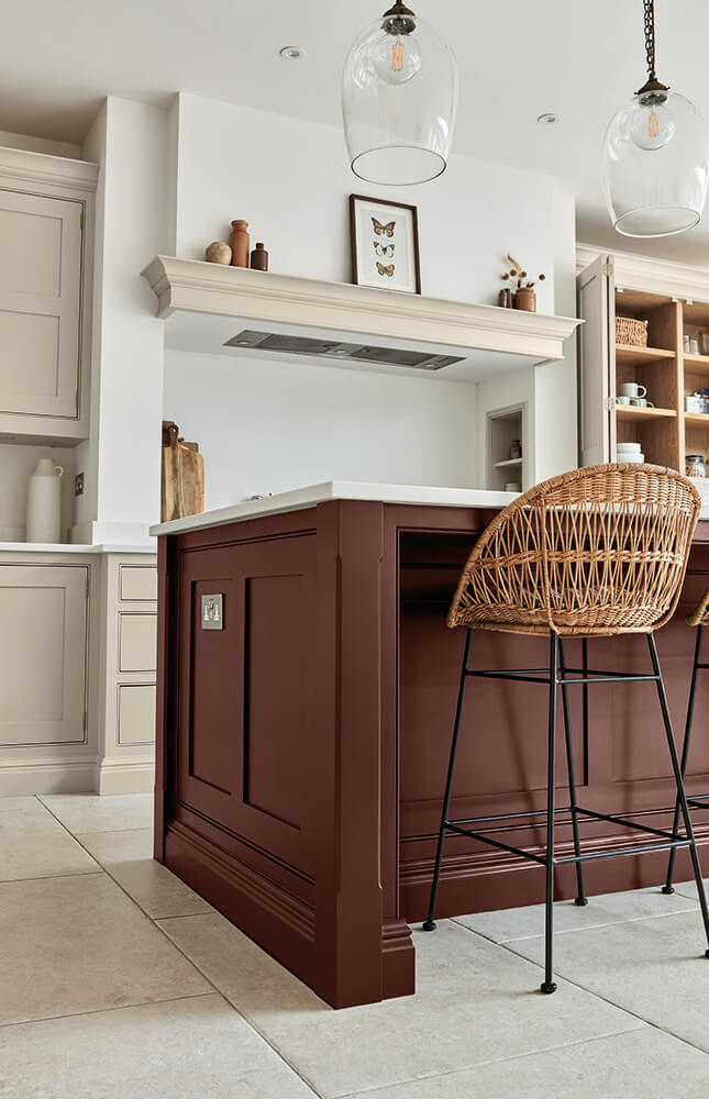
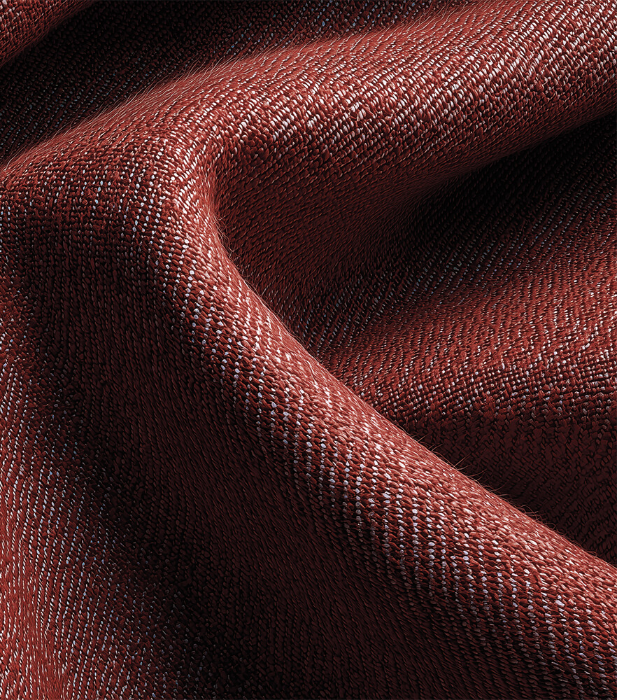
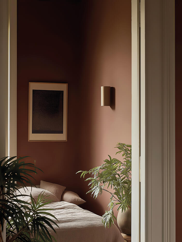
If Hazelwood is about quiet elegance, Sumac is its spirited counterpart. A deep, earthy red softened with russet undertones, it strikes a delicate balance between boldness and warmth.
On cabinetry, it feels both classic and unexpected, the kind of colour that makes a kitchen sing without shouting. It pairs beautifully with lighter neutrals such as Anise and finds harmony with Natural Oak, which tempers its intensity. For worktops, consider the softness of Caesarstone Organic White, allowing Sumac’s richness to take centre stage.
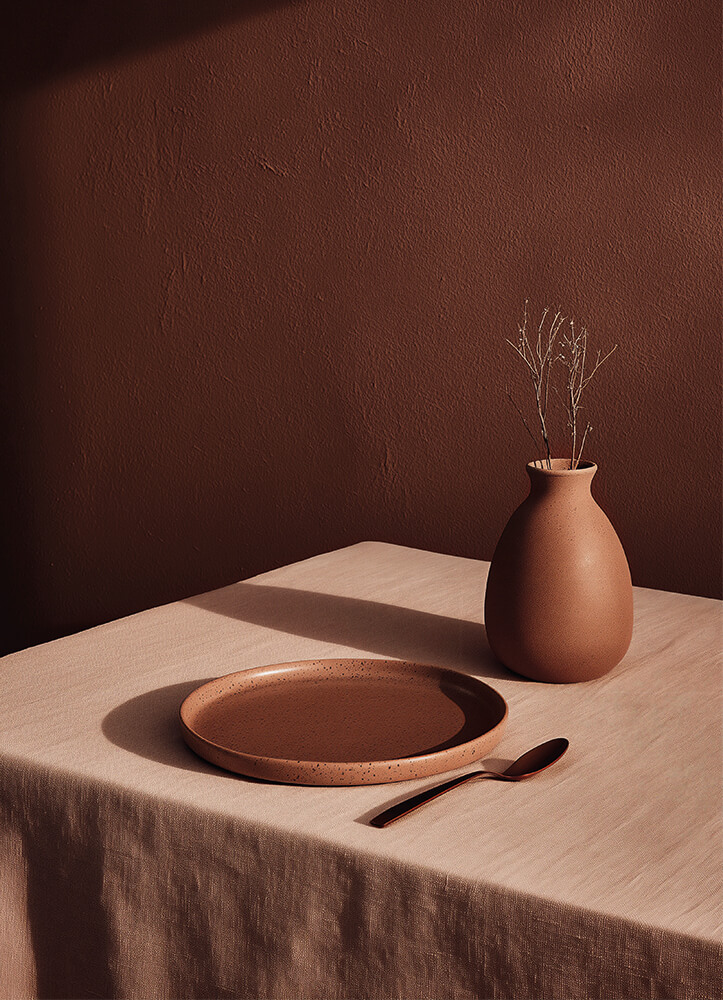
Red colour schemes are classic for a reason — they’re elegant, welcoming, and much more versatile than you might think.
Creative Design Director, Tom Howley
Rebecca Hughes of Rebecca Hughes Interiors echoes this sentiment: “Deep reds pair beautifully with mustard tones or golden yellows, creating a warm feel. Olive greens, creams, and soft warm whites also pair beautifully with burgundy, adding richness and balance.”
Red is also wonderfully adaptable across the seasons. In autumn, it feels cocooning and dramatic; in summer, a vase of sunflowers or fresh greenery against it brings the colour to life in an entirely different way.
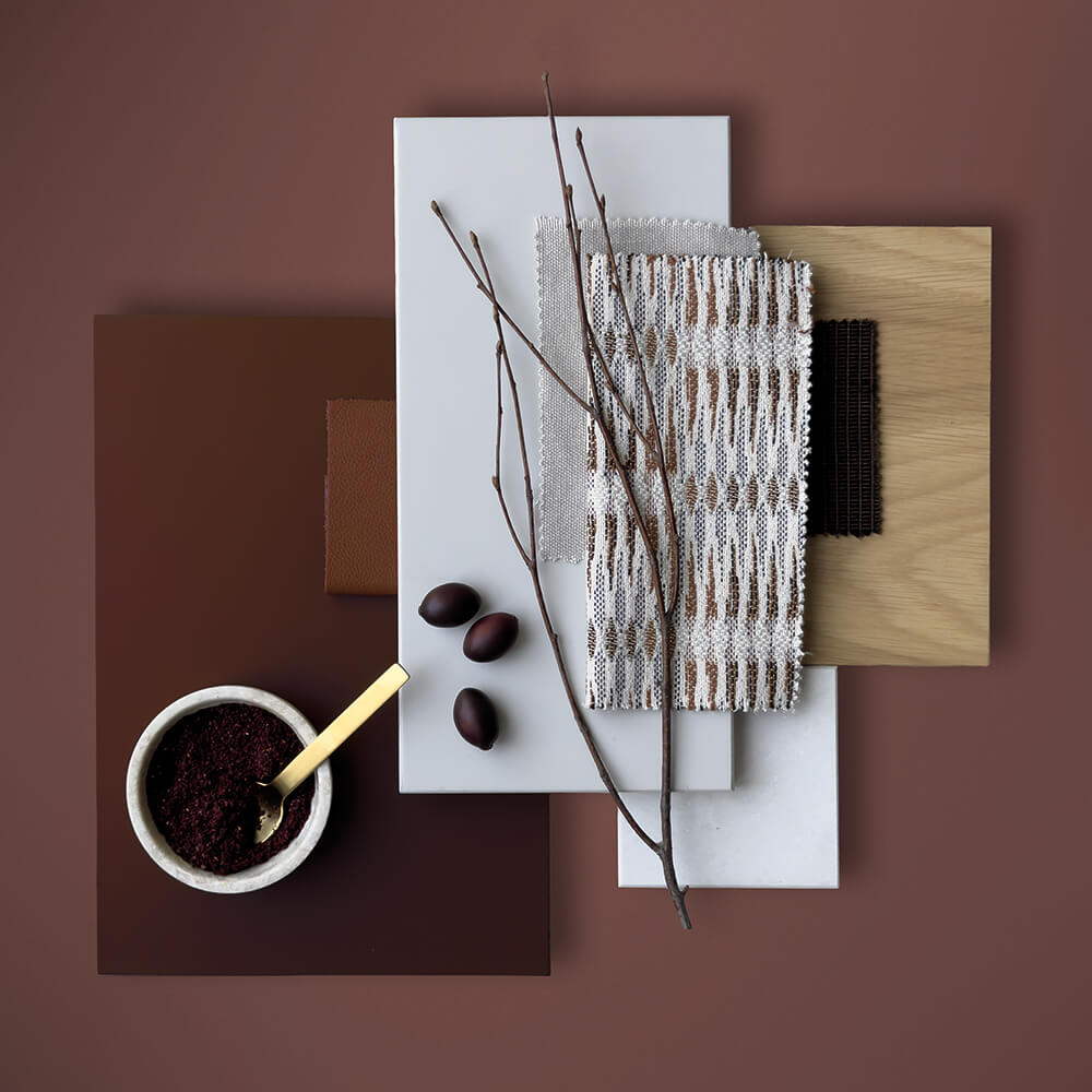

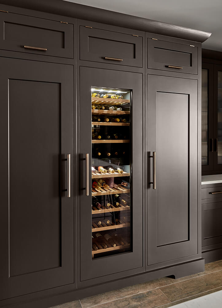
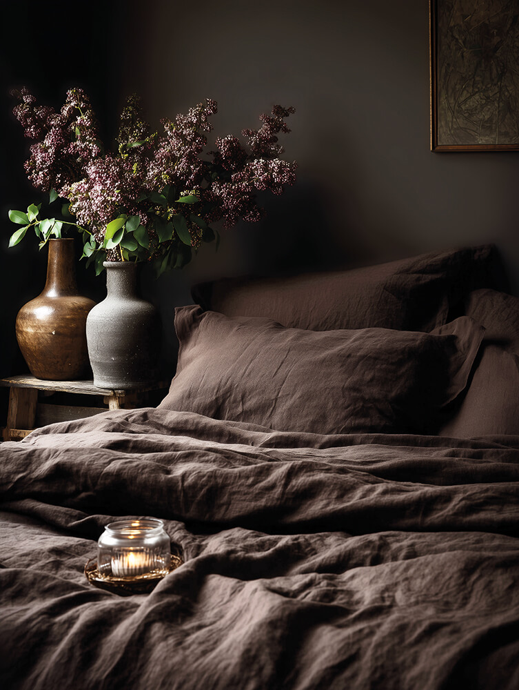
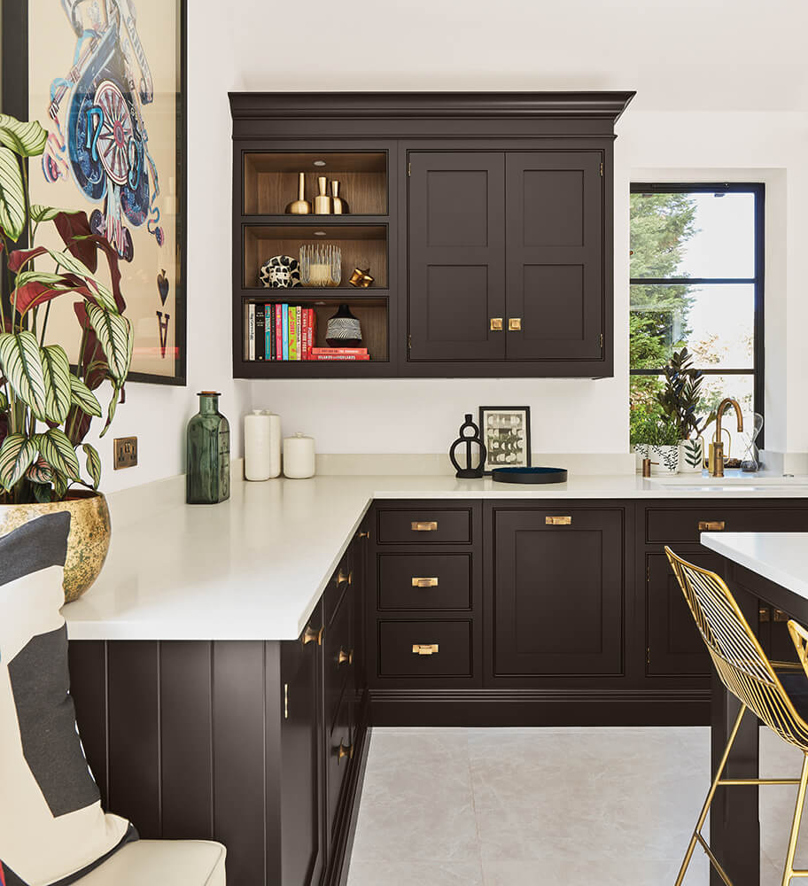
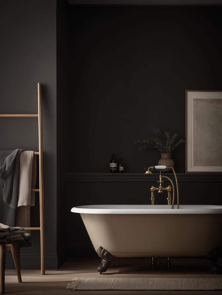
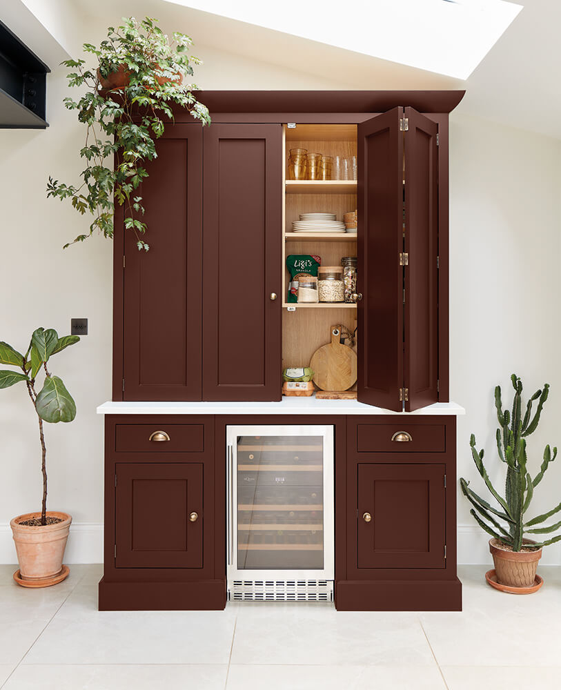
Hazelwood is a deep, soulful brown, inspired by the quiet strength of aged wood, fallen leaves underfoot, and the enveloping warmth of firelight. It’s a colour with gravitas, yet it has a natural softness that makes it beautifully versatile.
In practice, Hazelwood pairs elegantly with our Burnet paint shade, a gentle, earthy neutral that draws out its richness, and with Dusted Oak cabinetry for a layered, organic look. For a bolder scheme, it sits wonderfully alongside Caesarstone Vanilla Noir, a dark, moody worktop with subtle movement that enhances Hazelwood’s depth.
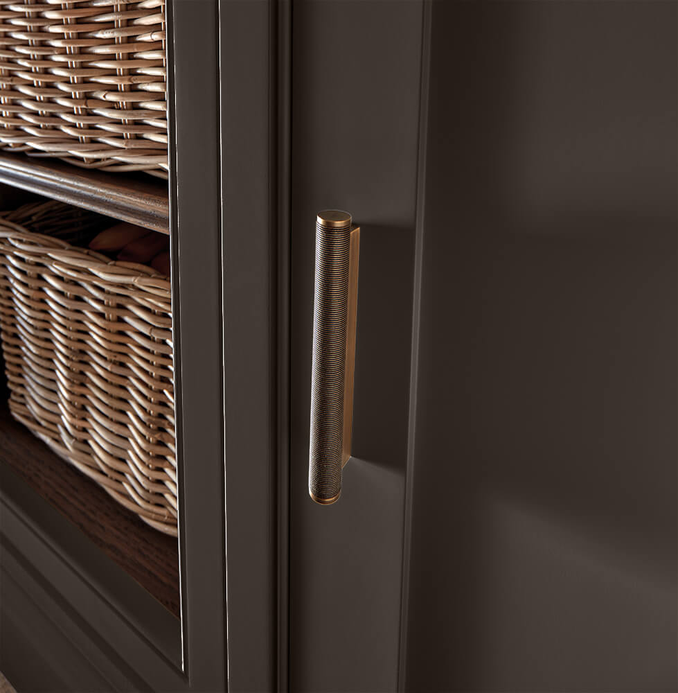
Brown is often overlooked in interiors, but it has an extraordinary ability to ground a space. In a kitchen, it brings comfort and sophistication, connecting cabinetry with the natural materials around it, from stone and marble to brass or gold hardware.
What makes Hazelwood and Sumac unique is the intention behind them. They’re not fleeting trends, but colours crafted to work across our cabinetry collections, hardware and materials, ensuring they feel at home in both traditional and contemporary designs. As Tom puts it: “We design with intention. Everything from the cabinetry to the colour is there for a reason.”
You can explore them in detail — alongside inspiring moodboards, colour pairings, and expert insights in our Seasonal Colour Edit Lookbook. Download your free copy here.
Or, visit one of our showrooms to experience these colours in person and see how they can transform your kitchen.