Back to Blog
Follow us


Colour at home is more than just decorative. It shapes how a room looks, of course, but it has a surprising impact on how it feels, and how we feel when we spend time in it. In a kitchen, where so much daily life unfolds, that impact can be especially powerful.
From the rise of the pink kitchen to the advent of “dopamine décor”, kitchens are feeling more fun, more experimental, and more personal than ever before.
At Tom Howley, we’re launching four new colours designed to meet this explosion of colour at home, and to give our clients the colour confidence to move away from “safe” whites and greys in their next kitchen renovation.
We’ve explored how versatile a pink kitchen can be, and how colour can be used to transform a space without a full reconstruction, and now we’ll be looking at the psychological impact of colour, and how a colourful kitchen can enrich your life in more ways than you might expect.
Colour psychology is everywhere. It’s why warning signs are red, why software companies so often brand themselves in blue, and why you’ll never find a spa decorated in neon yellow.
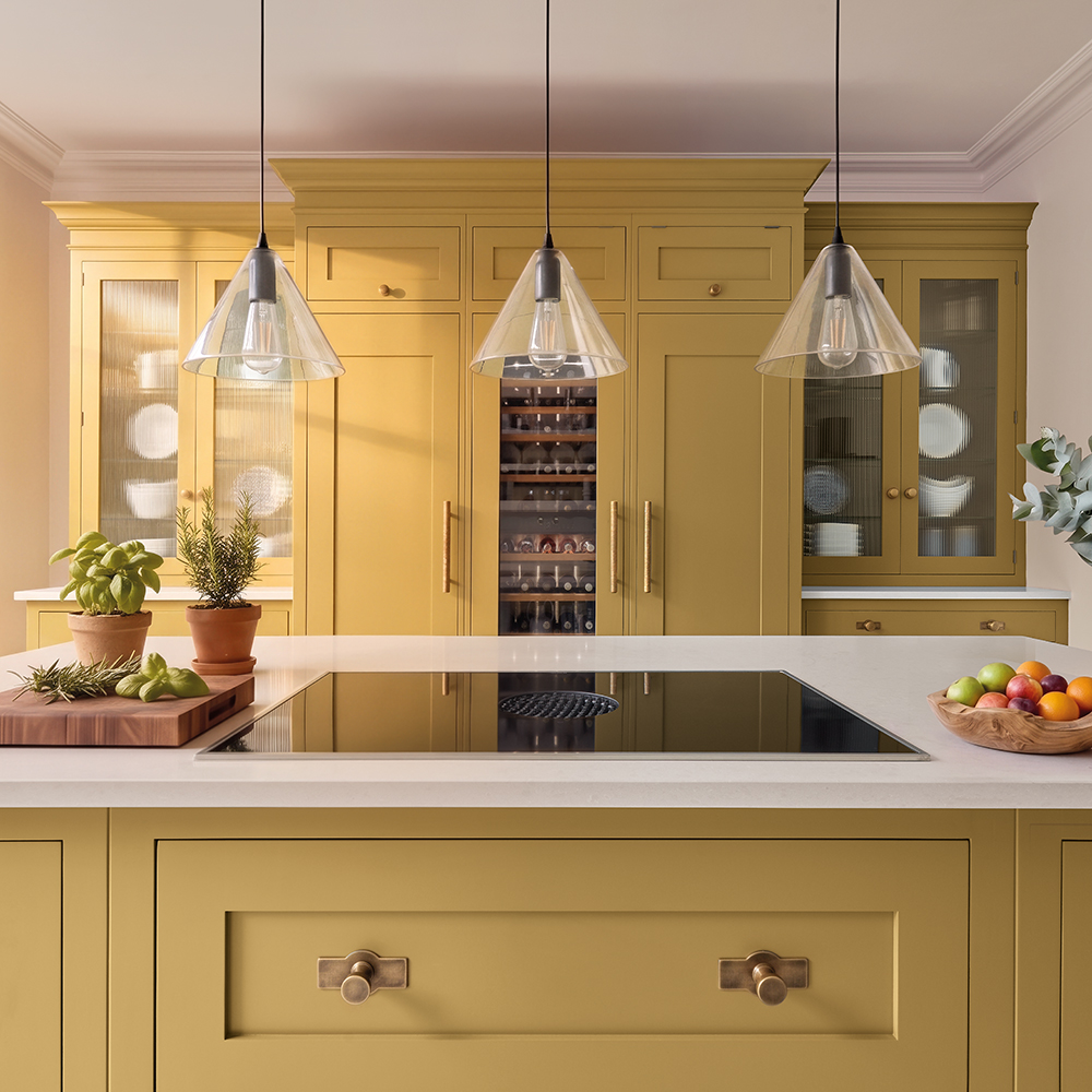
Warm yellows, soft pinks, coral, and terracotta tones exude warmth, and they’re colours our designers return to again and again. These are colours that carry a wonderful energy with them, bringing optimism and sociability into the most-used room in the home. They’re particularly effective in kitchens that need a little extra light, or in spaces where you want to inject personality and playfulness.
Done well, a joyful kitchen doesn’t just look good – it sets the tone for your entire day.
How to create the feeling:
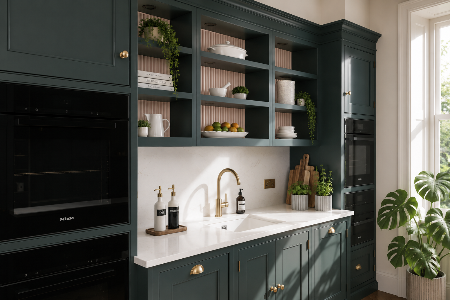
In homes where the kitchen naturally feels a bit darker – like basement, galley, or north-facing kitchens – our first instinct is often to fill it with bright white to compensate. However, with a bit of bravery and boldness, these rooms can be transformed with deeper, richer tones, applied cleverly to create warm, safe, cocooning rooms that feel atmospheric and luxurious.
How to create the feeling:
On the cool side of the colour wheel, you’ll find nature-inspired tones that feel like a breath of fresh air, a walk in the forest, or the cool balm of the ocean waves.
Muted green and navy have both been popular in the kitchen space for many years, and for good reason. They offer an oasis of calm, and roll out a sense of warm, rich luxury all in one. They feel rich without stuffiness. They make a kitchen feel calm, even when everything in it feels like chaos.
How to create the feeling:
You’ve heard the kitchen described as the heart of the home a million times, but at Tom Howley, we know that title belongs to the people who live there. We see the kitchen as the supporting player, as the backdrop, as the setting where we spend time not just cooking, but talking, learning, and living.
While a kitchen you love can’t make every day sunshine and roses, it can take away the interruptions and inconveniences that come up time and time again in a home that doesn’t work for you.
With this in mind, the way a kitchen looks and feels impacts us for a significant chunk of time every day. A kitchen isn’t just seen – it’s experienced, repeatedly, every day.
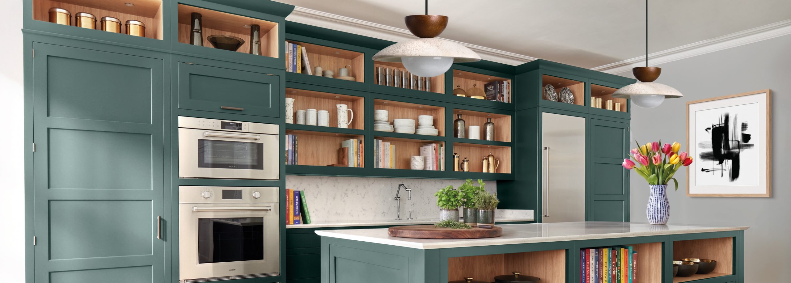
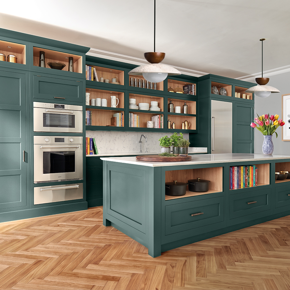
Sea Smoke takes familiar green kitchen shades and puts a coastal twist on them with a deep mineral teal undertone.
Sea Smoke is a colour whose character comes from its sense of balance. Balance between green and blue, saturated and muted, warm and cool, bright and deep, calm and characterful.
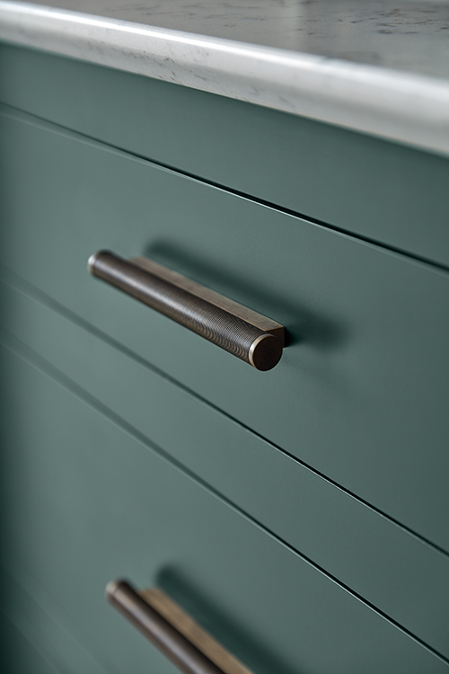
This means it’s grounding without feeling heavy, and injects colour without feeling overpowering. For many clients taking their first steps in a colourful kitchen, a shade like Sea Smoke is the perfect place to start.
Tom Howley Designer Connie Sharp says:
“The new colours feel calm and regal with a lovely heritage feel, especially Sea Smoke. Sea Smoke has a real sense of depth and is highly pigmented, which makes many colours feel timeless in the kitchen.”
Sea Smoke brings together the calm qualities of blue and green with the depth of a darker tone, making it perfect for kitchens that want to feel both uplifting and settled.
Your kitchen deserves to be more than functional. It deserves to be felt.
Colour is one of the most powerful tools in kitchen design. Colour shapes how it feels to stumble bleary-eyed to the coffee machine in the morning, how it feels when the space is full of voices and activities, and how it feels to pour yourself a glass, stop, and take stock at the end of the day.
Whether you’re drawn to the grounding depth of Sea Smoke, the joyful warmth of a soft pink, or the irresistible luxury of deep jewel tones, the right colour in your kitchen isn’t just a design choice. It’s a mood you choose to come home to.