Back to Blog
Follow us


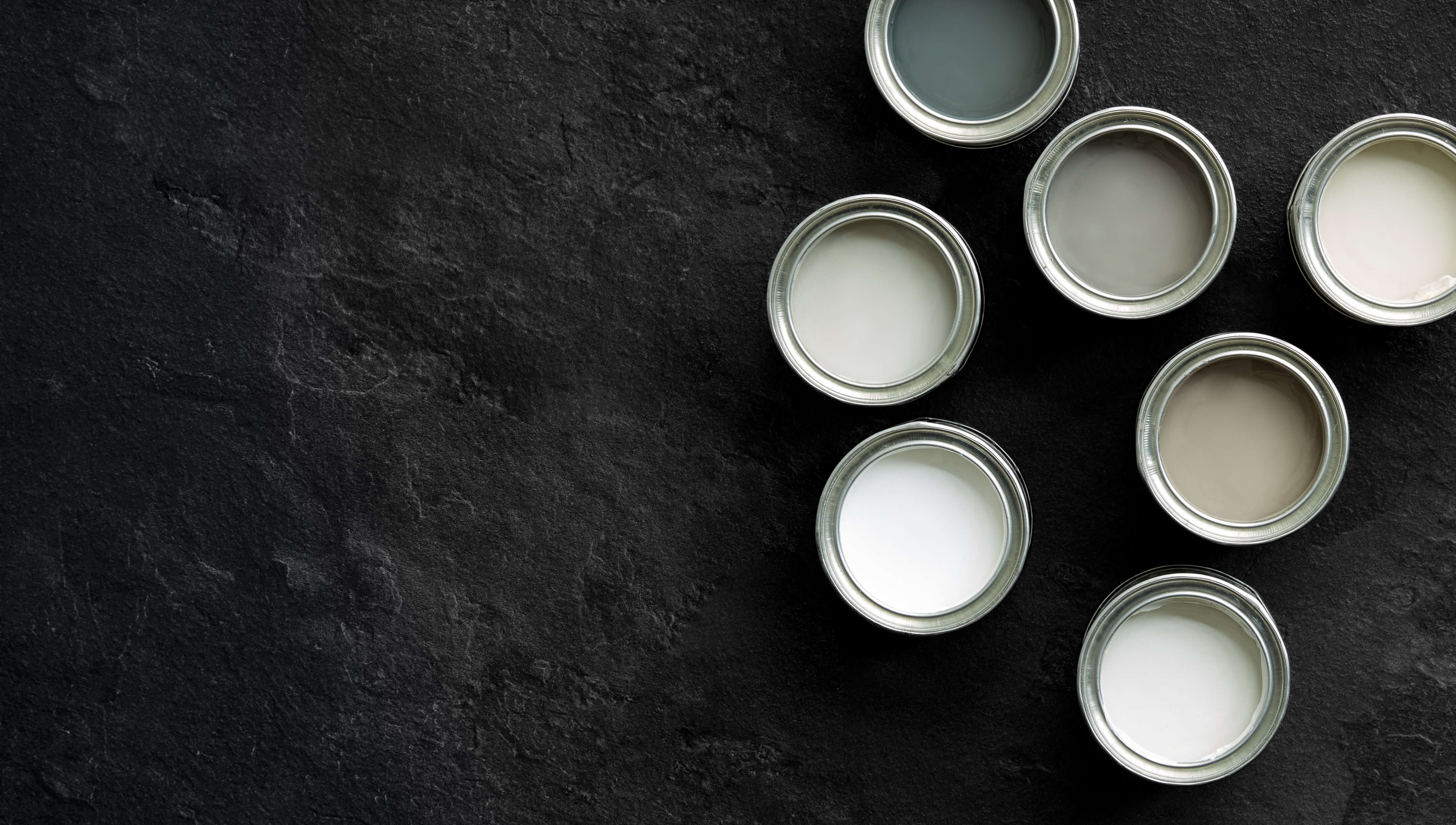
Colour sets the tone of a space, it tells a story and provides an environment to feel at home in. We’re lucky to have sixteen stunning Tom Howley paint colours in our collection, all painstakingly curated to complement exquisite kitchen furniture. Simple yet beautiful, our palette consists of whites, medium and dark neutrals, all working together in harmony.
Choice of colour is critical to the success of your kitchen design. Chosen correctly a room will stand the test of time, which is why we spend hours ensuring each colour palette chosen, complements all elements of the kitchen. Develop a colour scheme that works for you, not just because trend forecasts say so.
We’re becoming braver with our interior choices, particularly with the reemergence of colour in the kitchen. There’s a style and palette out there for everyone. Whether you love minimalistic nordic design or rich maximalist aesthetics, it’s just a matter of discovering what really excites you. This years most talked about colours range from warm neutrals and dark charcoals to soft sage and exotic bolds, so there’s no shortage of inspiration out there.
Below are a few of our most popular paint colours, all a perfect choice for providing stylish calm backdrops for you and your family.
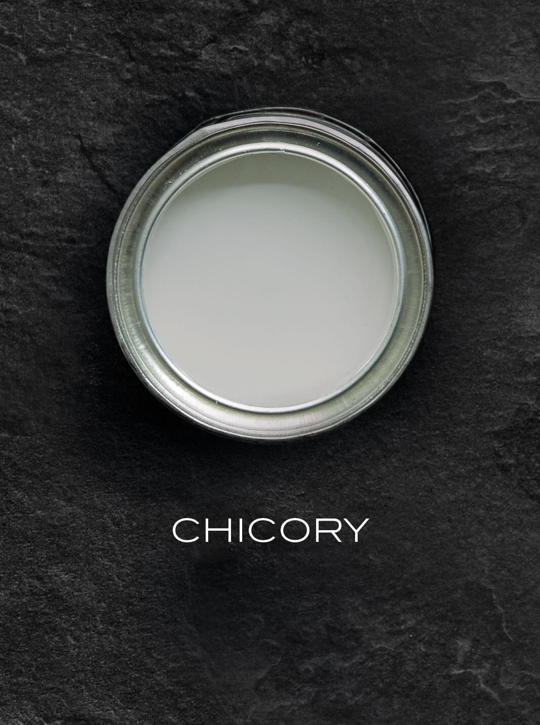
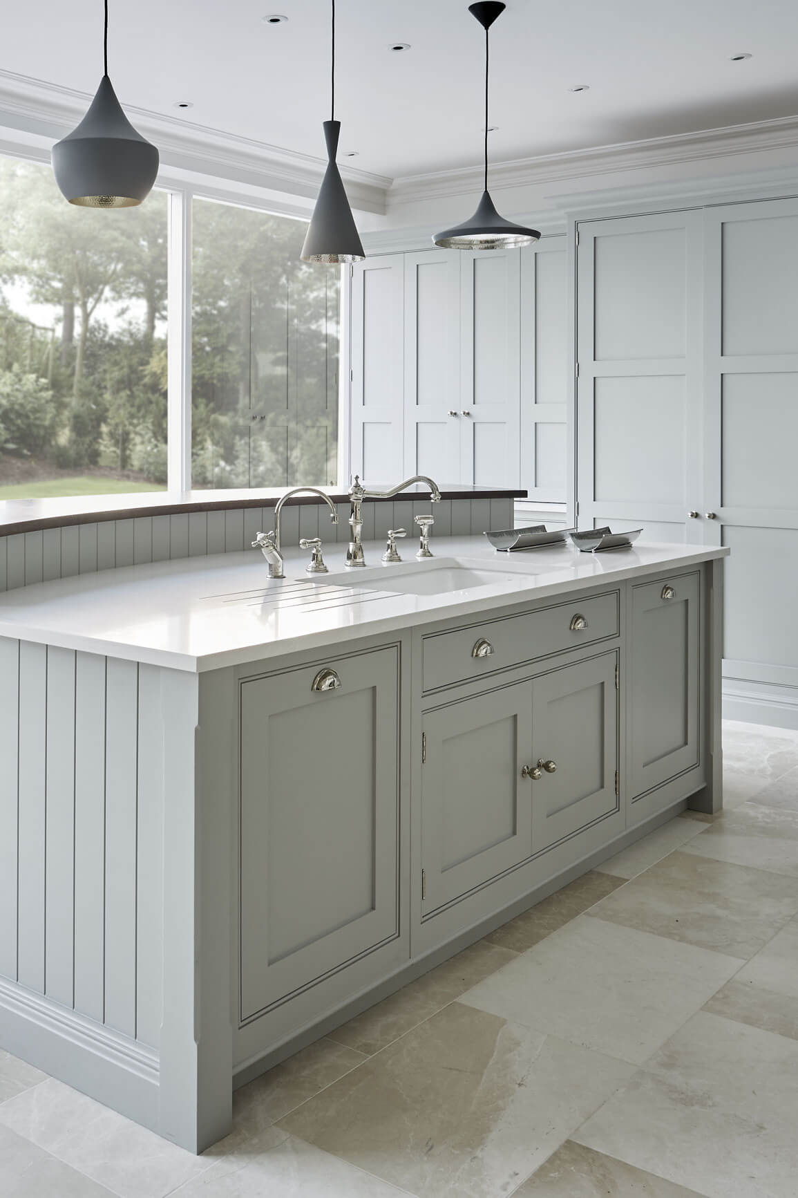
Grey Shaker – Chicory
Our bespoke colour Chicory creates a contemporary yet timeless look in any kitchen. This serene shade of grey works in unity with rich dark oak accents and white Silestone Yukon in this open plan kitchen. Grey shades are known to stand the test of time, they are however sometimes overlooked and perceived to be cold and harsh. If you’re worried about a space feeling vacant and cool, make sure you choose warmer hues and pair them with natural wood finishes, this will give a room a captivating sense of warmth and depth.
Before you reach for trusty whites think about using this hugely versatile colour as an alternative. You have the ability to create a one of a kind space, inject a little of your own personality and mix up how you use grey within your home. Create harmony with woven and wood textures or be bold with inky blue accents.
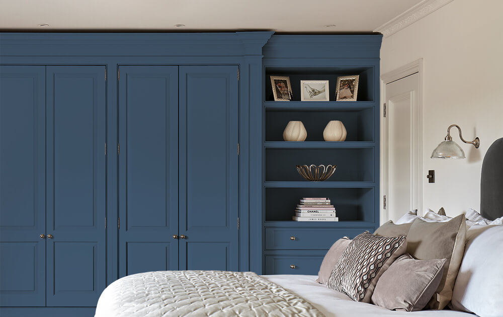
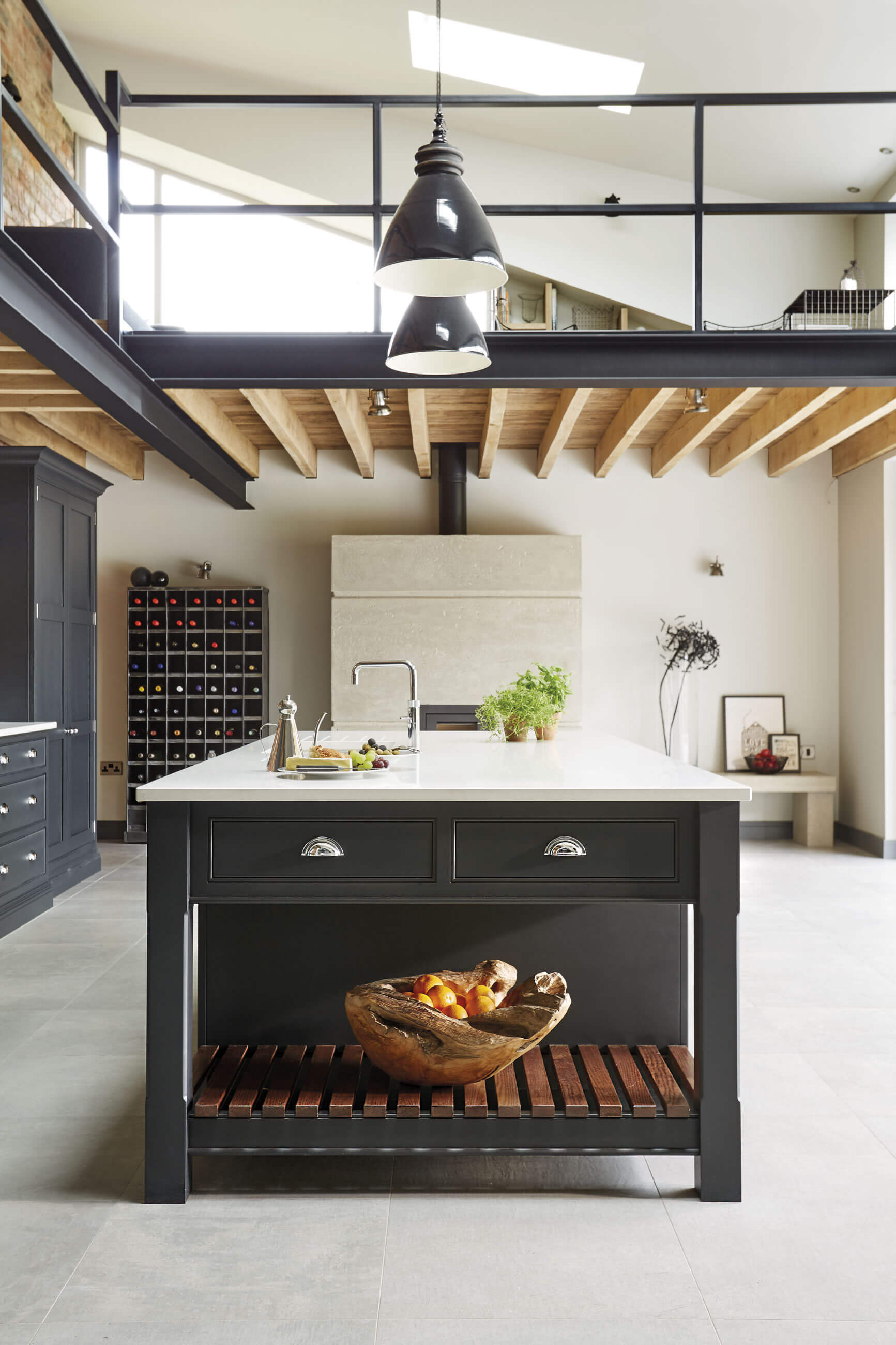
Dark industrial – Nightshade
Trend experts, such as WGSN have not only predicted dark colour pallets will take over this year but will continue to be popular moving into 2019. We’re seeing this trend emerge in everything from taps, tableware, lighting and even appliances. Dark colours are a great option if you want to create a sleek, contemporary look. Our bespoke colours Nightshade and Lithadora are no exception. Dark shades can come across as intimidating, however, it’s in the way you use them that changes the feel.
One of our favourite ways we’ve used this stylish colour is in our industrial style kitchen. The fusion of natural materials and the Nightshade paint finish creates a stunning combination that’s both bold and luxurious. The colour adds a nod to the industrial metal structure in this large space retaining an element of contemporary sophistication.
Rather than committing to colour for a full kitchen design, add bolder shades in gentler ways through the use of accessories and fixtures. Source stylish matte black lighting that fits seamlessly within high ceiling space or display beautiful kitchenware on open shelving such as traditional black Le Creuset.

Colour can have a huge transformative effect on our homes. Creating a positive or negative ambience within a space, it’s important to choose the right colour palette that reflects and balances your individual needs and personality.
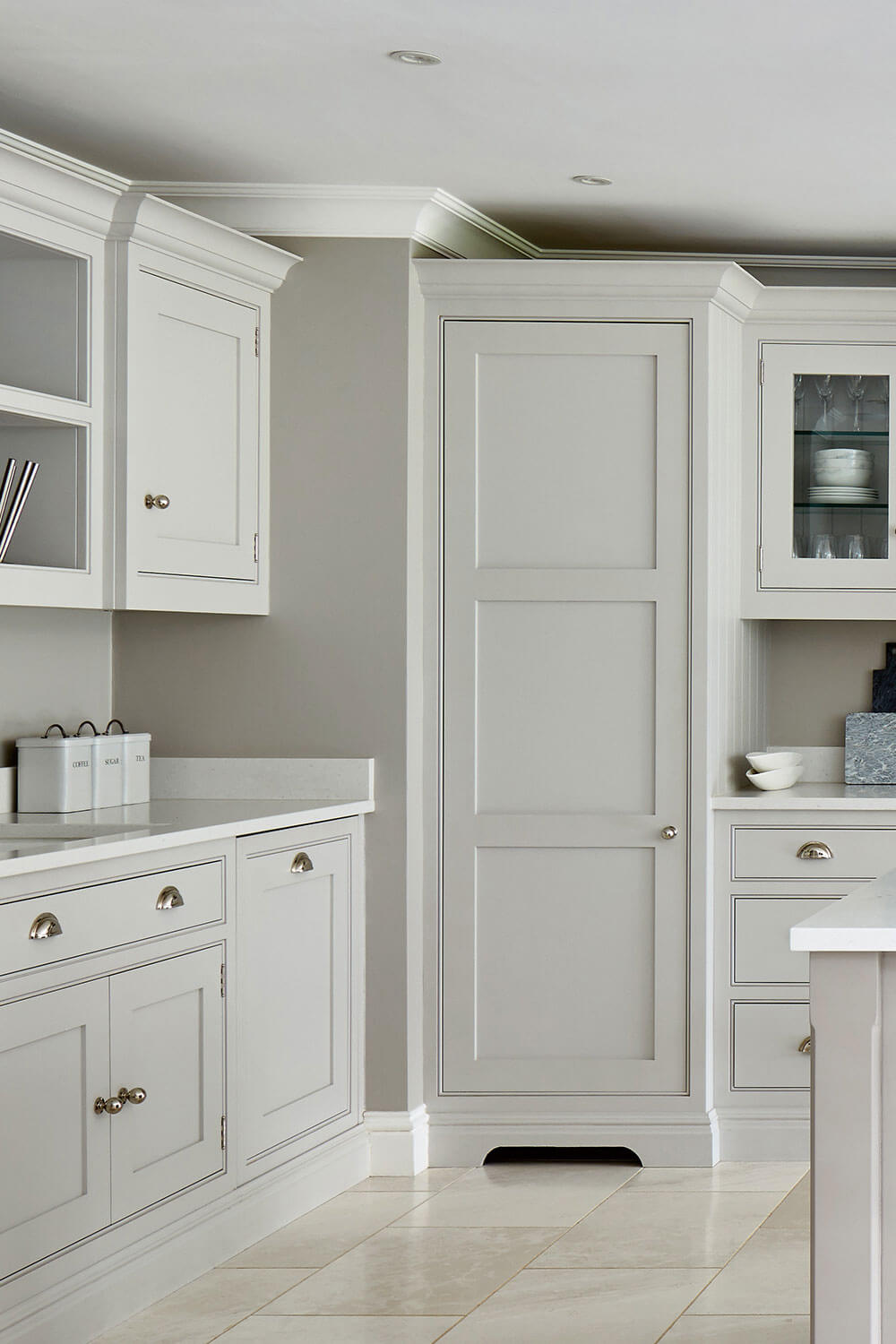
Considered one of the safest colour choices, neutrals and off-white kitchens create the perfect balance of light and space. Two of our most popular shades are Tansy and Sorrel, beautifully understated and timeless they create truly stunning kitchens enhancing architectural interest, all without the need for bold colour. The key with a neutral kitchen is to pair it with contrasting walls and textural elements. This will give the design an edge, and create appealing visual interest.
Take our Sevenoaks open plan grey kitchen. Contrasting warm grey walls add a tonal edge, while smooth white stone worktops contrast with the painted cabinetry, making this space both stylish and inviting. Using neutrals within your design doesn’t mean you should steer away from brighter colours. Light shades provide the perfect canvas to add statement accessories and pops of colour.