Blog
Green Kitchens Walked So Yellow Kitchens Could Run
Interior trends rarely do a complete 180 in the space of a few years. While trends are coming and going faster than ever, existing trends still inspire new ones, often evolving in a way that feels natural, until it’s something new entirely.
The colourful kitchen, and in particular the rise of yellow in kitchen interior schemes, is the perfect illustration of this pattern.
The Reign of the Green Kitchen
In the last 15 years, the green kitchen has become ubiquitous.
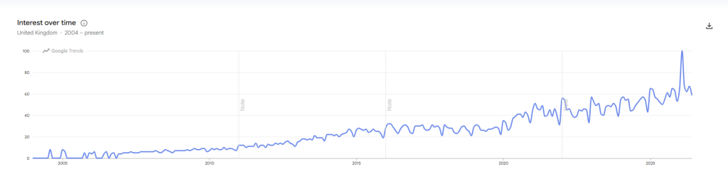
Since the early 2000s green kitchens have been a point of cultural interest, according to historical Google search data, with popularity spiking from as early as 2011, and growing steadily ever since.
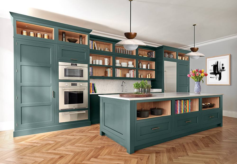
Green promotes calm as it feels so grounded and inspired by nature. There’s also such a variety of green tones that work in a kitchen, from deep teal and rich olive to muted sage and fresh fern green.
Why Green and Yellow Feel Like Friends
In the 2010s, colour in the kitchen was considered much more of a bold move than it is today. For many people redecorating at this time, sage green was a bold choice, injecting colour into a space that had been dominated by greys and neutrals for quite some time.
Today, the yellow kitchen both mirrors and expands on the green kitchen’s trajectory from 10-15 years ago. While colour is much more accepted and celebrated in kitchen décor today, the bigger, bolder tones like yellows are just starting to find their place, with 47% of respondents in the NKBA/KBIS 2026 Kitchen Trends Report choosing yellow as a colour they’d consider in their kitchen. Yellow has become the next bastion of colour in the kitchen, just like green was a decade ago.
Green and yellow also sit next to each other on the colour wheel, and so have a lot of shared design language. They both pair well with warm natural materials like wood, brass, and stone, so a transition from one to the other feels easy.
If you feel inspired by a green kitchen, but don’t want a space that feels so ubiquitous, a yellow kitchen can feel like the logical next step into a world of colour.
Discover Sandstone
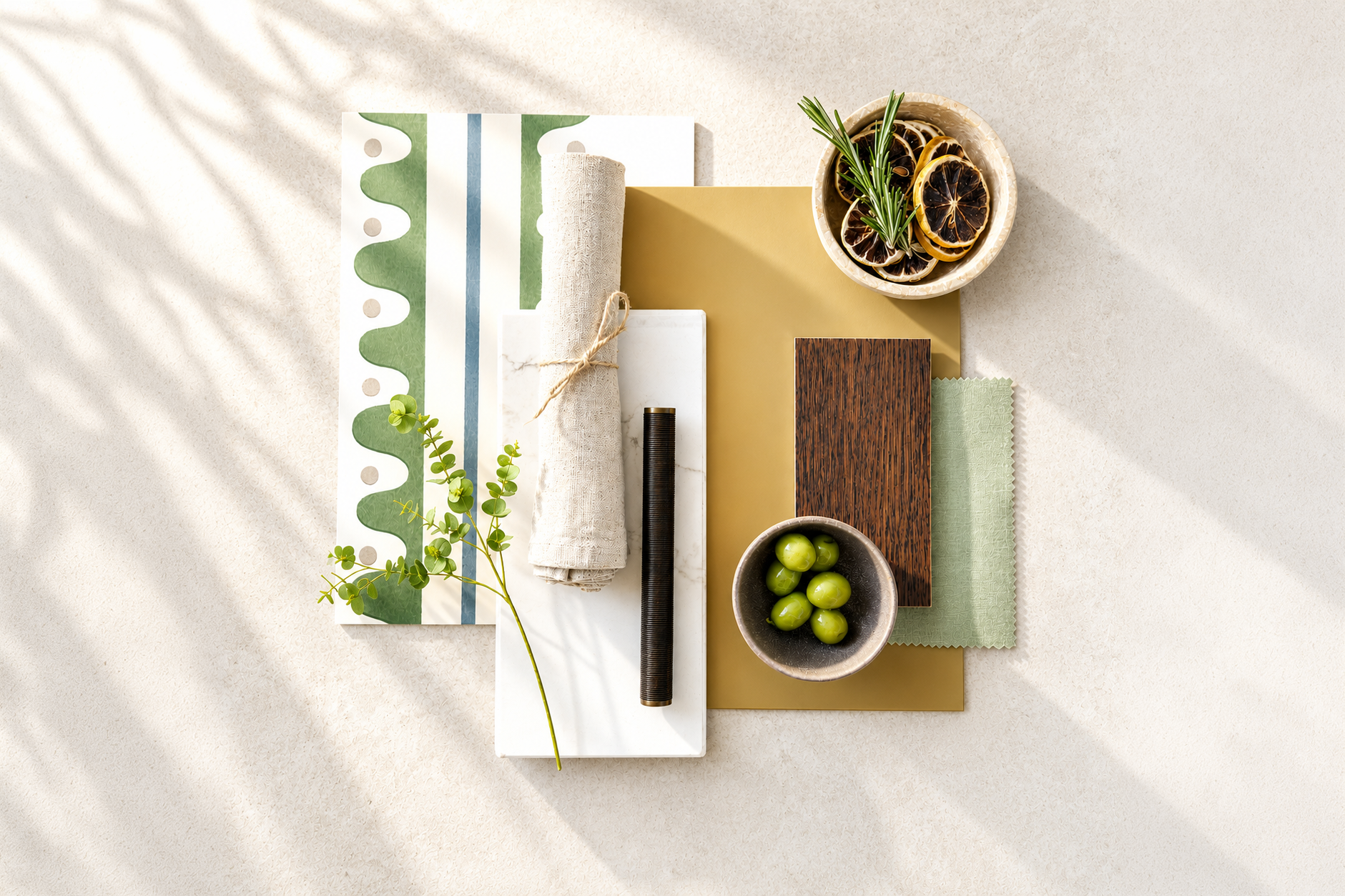
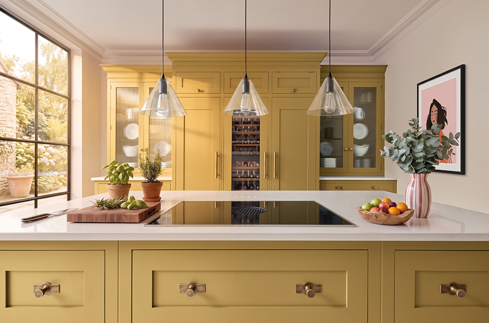
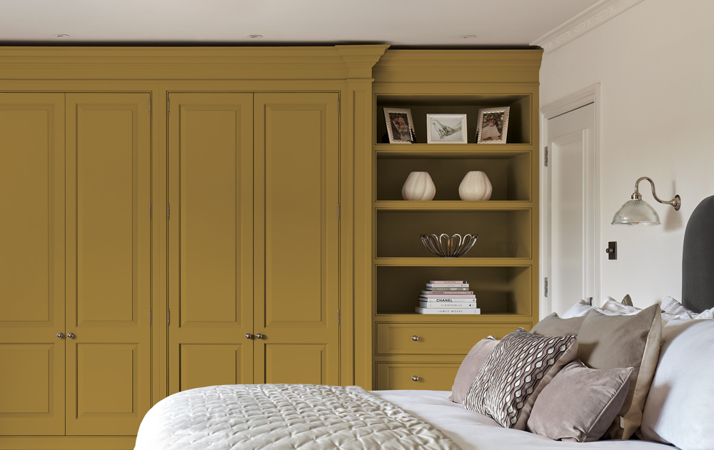
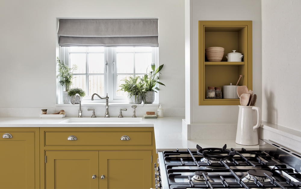
With Sandstone, we’ve melted sun-warmed rocks and golden middays into a shade that is soft, rich, and utterly joyful.
Designing with Sandstone is all designing with feeling. Yellow is such an emotive colour, which means it doesn’t fade into the background, while its strong emotional pull also makes it a colour that will stand the test of time.
“A pale mustard shade like Sandstone is a great addition to the Tom Howley collection, and can feel really timeless when paired simply with natural materials and finishes.” – Lucy Nash, Tom Howley Designer
How to Escape The Safe Kitchen with Sunshine Shades
We know that for lots of homeowners, a yellow kitchen is a bold step. Some of the most common hesitations our designers hear when it comes to colour, and yellow décor in particular, include it feeling dated quickly, concerns about resale value, feeling like it’s just “too much”, and not being sure how to style a space that’s so bright.
This is what we tell them:
“It’ll Date Quickly”
Lots of us associate colours – especially yellow – with that very specific 70s mustard-and-avocado kitchen aesthetic. There’s a fear, understandably, that a yellow-led scheme will feel dated, rather than timeless.
Additionally, we created Sandstone knowing that we wanted a bright yellow in the Tom Howley palette, and so we knew this would be a common concern. That’s why we mixed Sandstone to borrow more from the natural world than from current trend cycles, conjuring that organic, timeless feeling that so many of us want in our kitchens.
“It’ll Affect my Resale Value”
When we talk about escaping the safe kitchen, this is exactly the kind of thinking we’re trying to get away from. When we design our most-used spaces around others perceptions, and potential resale, we lose out on feeling connected to our home, to feeling like it’s really our own.
We’re seeing more homeowners reject designing their spaces for a hypothetical buyer in the future, and we encourage our clients to design for their own lives, preferences, and personalities.
“It’s Too Much for an Everyday Space”
When it comes to making colour decisions in your kitchen, the stakes of “getting it wrong” feel that much higher, as it’s a space that gets used so often.
When we hear the fear a colourful kitchen might be “too much”, we often ask “too much for who?”. If a space brings you joy, there’s no such thing as too much.
Our designers can also offer expert guidance on using colour at home in a way that feels more restrained and considered – you don’t always have to jump in with both feet straight away!
“I Don’t Know How to Style It”
Some people have a gaudy, childish association with the colour yellow, particularly with brighter, more saturated school-bus or lemon tones. This is probably the biggest psychological barrier we see to designing with yellow, so it’s a good place to explain how undertone changes everything.
By desaturating a bright yellow, with muted, slightly greyed-down tones, colours like Sandstone read as sophisticated and warm, rather than primary-school-poster-paint.
Yellow shades are also surprisingly versatile when it comes to styling. It works well with browns and natural wood tones, with complementary colours like dusty pinks, terracotta, and deep earthy reds, but also styled with pops of contrasting colours for a more modern look that feels endlessly fun. And of course, you can never go wrong when combining yellow with warm, natural finishes like stone and brass details.
Step Into Colour With Tom Howley
Yellow is more than a passing trend, it’s the natural next step for anyone who’s loved what colour can do in a kitchen. With a shade like Sandstone, you get warmth, personality, and timelessness in one palette.
If you’re ready to swap safe for sunshine, our designers are here to help you bring it to life. Download a brochure or book a design consultation today and start designing a kitchen that makes you smile.