Back to Blog
Follow us


A dilapidated farmhouse set in the heart of the Somerset countryside could have been a daunting project for some. Not for our clients or the team at Tom Howley, who transformed this dramatic space into a stylish contemporary kitchen and living area.
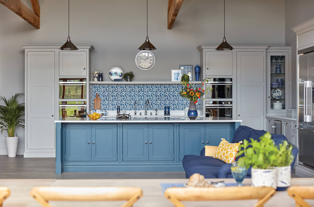
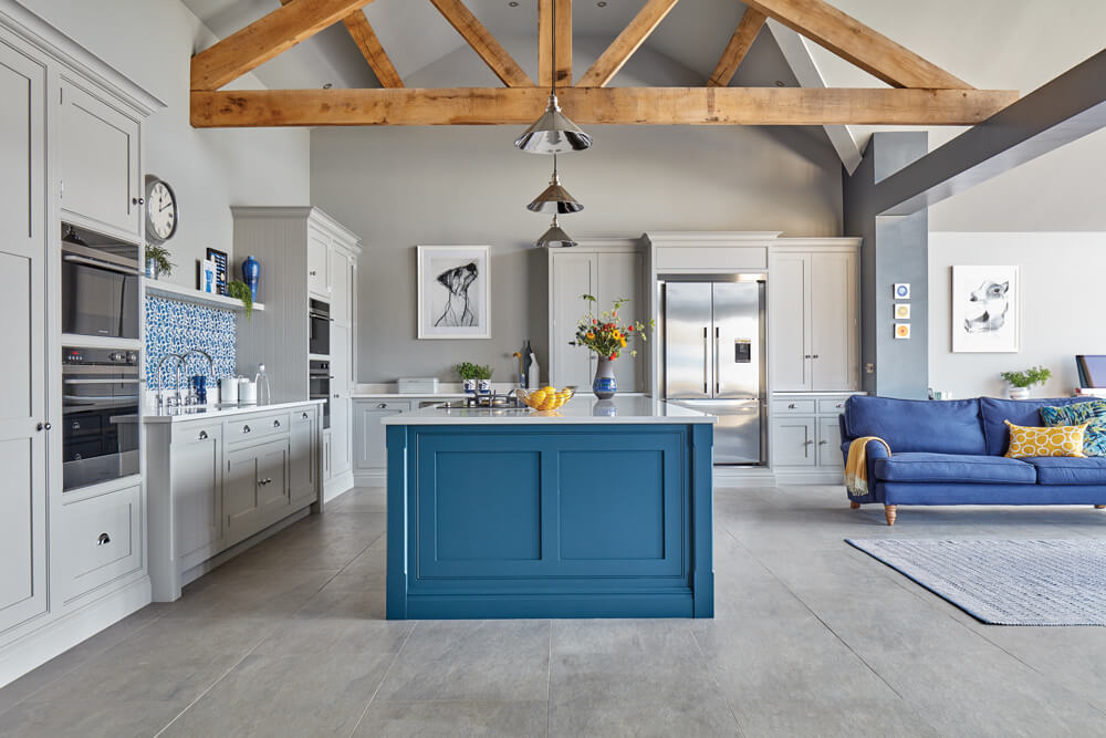
The expansive room fills with natural light from floor-to-ceiling windows which frame stunning rural views. The light brightens every corner of the Shaker-inspired Hartford kitchen design, which was re-imagined to give this unique kitchen a bespoke, modern finish. As keen cooks, our clients wanted to focus their energy on creating a contemporary kitchen that would combine tasteful design with the practical function needed to conjure up very special family dinners.
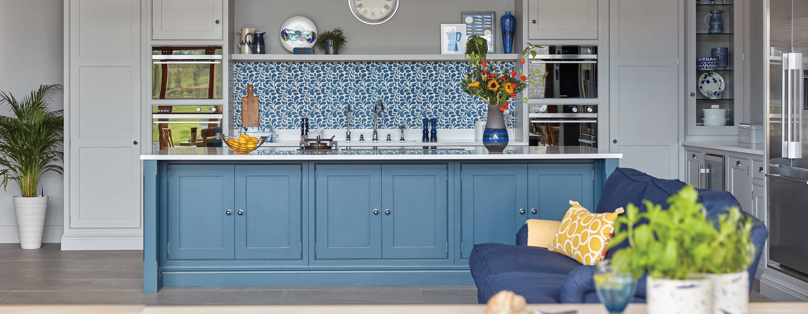
Made-to-measure wall cupboards make full use of the room’s ceiling height, and a spacious island brings extra storage and additional seating to the table. The island is positioned so that the cook can gaze through the vast bi-fold doors onto the picturesque countryside beyond, while also creating a more social atmosphere to interact with guests when prepping food.
We caught up with Sarah, our talented stylist, to find out how she worked with the space to create a magnificently stylish yet welcoming feel.
The first thing that struck me about this space was the huge amount of natural light coming in through full-height bi-fold doors, effectively connecting the indoors and the rural outdoors. The client also liked strong colour choices, and this could be seen in the feature tiling and furniture, which influenced my styling. If a client is confident with colour and has a playful approach, I will run with that.
The large island with its wonderful countryside view is a bespoke piece that was designed with the client’s needs in mind. The inclusion of informal seating is the client’s suggestion. I also like the large dining area that runs parallel to the bi-fold doors. In the summer, the doors can pull back to merge the indoor and outdoor spaces into one huge living and entertaining space.
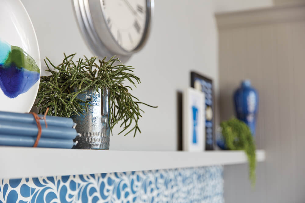
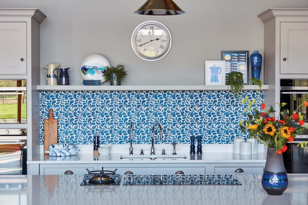
It’s always vital to keep scale and proportion in mind. Any vase, bowl or sculpture has to be large, or it will look completely lost. Small groups of items can make the top look cluttered. It is always better to select just 2 or 3 well-proportioned, impactful pieces.
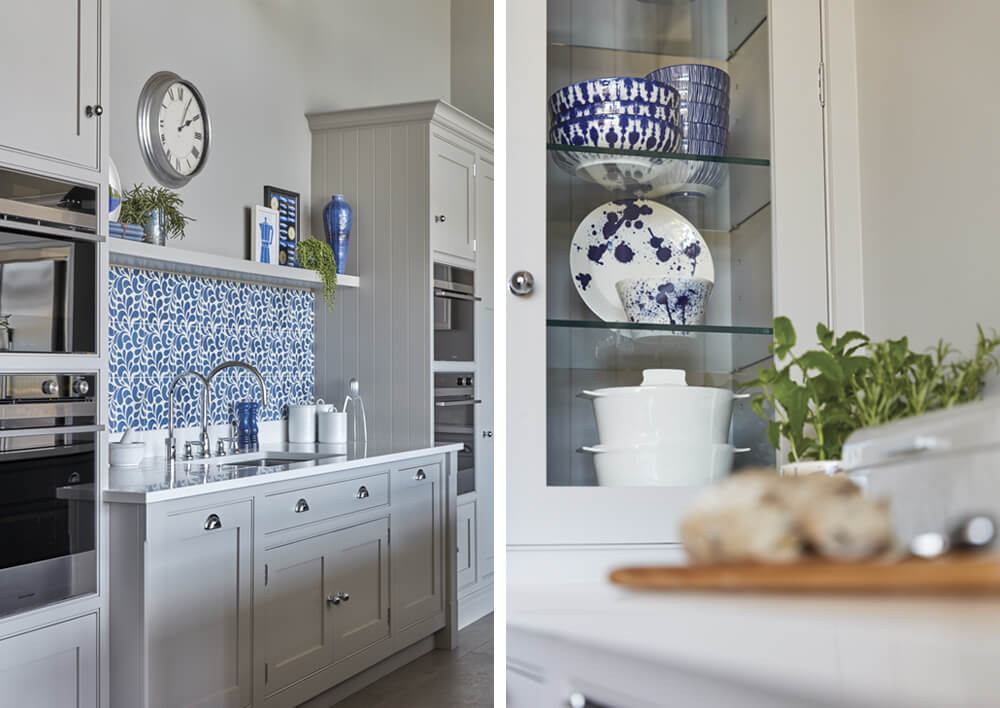
Keep the less attractive functional clutter hidden away in the cupboard spaces. Give display space to practical items that have a stylish beauty of their own – like the iconic Alessi Salif Citrus squeezer and Trinity fruit bowl. Worktop areas need to be mainly kept clear to emphasise the flow of a spacious well-planned kitchen and to promote a calm streamlined look. I like to see decorative crockery behind glazed doors, or on open shelving but it’s better to store away the items you use every day while keeping them within easy reach.
Open shelving gives you a great opportunity to experiment and play around with some of your most treasured items. Group items in odd numbers of threes or fives rather than having them evenly spaced – this tends to look too regimented.
Stack bowls, group candles or books and copperware. Vary the space between groups – space is just as important in the balance and flow of the display as the objects are. Within each group, try to get a variance of heights, textures and colour to create visual interest and to add personality.
These incredible handmade French ceramic tiles were one of the first things I was drawn to when it came to styling the kitchen. The painterly pattern and classic blue colour demonstrates how a patterned feature tile can have a real impact, and they work particularly well in this large space as they’re not too dominant and they shake up the simplicity of the cabinetry. With the tiles in mind, I chose quirky, contemporary prints in complementary blues, handmade textural ceramics and unusual shaped succulent plants. All crockery and table linens were chosen for their relaxed, handmade and textural qualities.
The Pantone colour of the year 2020 is ‘Classic Blue’ – an intense calming shade that works exceptionally well on a feature island. The colour pairs beautifully with warm neutral greys giving it more impact. You can pick out the colour in other accessories such as the sofa, cushions or artwork or, it could be an excellent choice for a feature wall – especially if accessorised with strong contrasting colours or graphic whites that would leap out from the dark shade behind.
In the Somerset farmhouse, I chose colours with equal intensity to the blue, like the bright sunny yellows and vibrant oranges of the cushions and the flowers. Also, the deep lush greens of plants help bring the outdoors in and stand out against the dark blues. I felt these colour choices reflected the lively and friendly personalities of the family who live here and love to entertain in this contemporary kitchen.
I would always recommend painting at least 1 square metre of the various colour splash choices either on the chosen wall or on a large piece of card or paper that you can move around and live with for a while. It is always vital to consider the colour in both natural daylight and then artificial light, as colours can appear quite different. Consider which artwork or treasured items you want to display and select a feature colour splash from those. It could even be a contrasting colour that makes the artwork sing out.
Request our latest brochure today to explore more exquisite kitchen designs or book your free design visit to begin your journey.