Back to Blog
Follow us


Have you ever felt pressured into making a decision that you knew in your gut wasn’t right?
Perhaps you’ve felt the classic “head vs heart” dilemma, or forced yourself to compromise on what you really wanted.
At Tom Howley, we’re longstanding advocates for designing spaces around the things you love, not just the things you think will look “right”, those that will increase your property value, or what you think others might like best, and we’re delighted to see the design tide turning in favour of deeply personal, joyful spaces.
As part of our new colour launch, we’ve been examining the change in today’s interiors landscape, and celebrating the move towards decorating for personality, not just for equity.
We’ve spoken to some of the UK’s leading interior designers and our brilliant Tom Howley design team to get their advice and guidance on how colour can make a kitchen feel joyful, what our new shades mean for the Tom Howley range, and how you can escape the safe kitchen in a way that feels true to you.
This launch sees us introducing four new colours to the Tom Howley palette: Pink Salt, Sandstone, Sea Smoke, and Sloeberry.
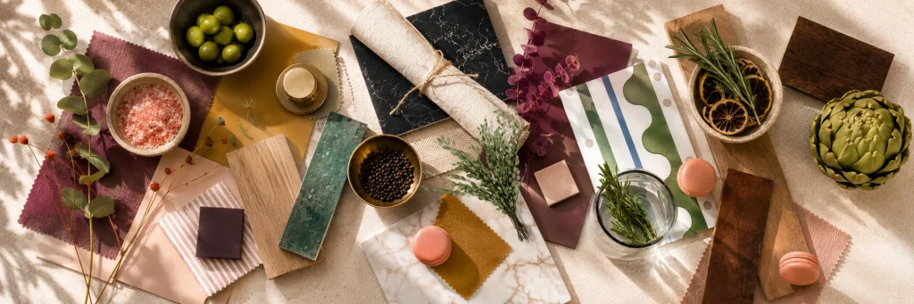
In their own way, they each mark a bold, colourful addition to our colour palette. Creative Design Director, Tom Howley says:
This collection is about moving beyond the idea that a kitchen has to be “safe” to be timeless.
For years, neutral palettes have dominated kitchen design. While they’re undeniably versatile, they don’t always reflect the personality of the people living in the space. These four new colours were introduced to offer something more expressive – shades that feel personal, characterful and considered, without losing the sense of longevity that defines our kitchens.
Each colour has been carefully developed to sit confidently within a home. They’re not trend-led, but emotionally driven. The aim is to give clients permission to choose something they genuinely love, rather than what feels like the safest option.
So how do you actually bring these colours into a scheme? We asked two designers for their take.
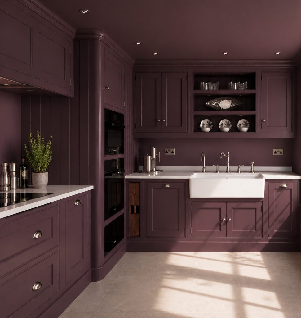
Colour drenching – using one colour across the whole room, including walls, cabinetry, ceilings, door frames, radiators, and skirtings – has become increasingly popular as homeowners start to embrace colour more.
We spoke to interior designer Samantha Todhunter for her perspective on how this trend can work in real kitchens:
I think people want their homes to be an expression of personality and to feel like they have a bespoke element with character rather than a white box. Colour drenching introduces atmosphere and depth, and when handled well, feels confident and entirely liveable, never overly decorative, performative or contrived.
In contemporary spaces it can sharpen clean lines and create clarity, while in more traditional settings it can soften and unify architectural detail. It is less about style and more about proportion and tone.
Consistency is key. Walls, cabinetry, doors and trim should be considered together to create a cohesive envelope. From there, depth comes through subtle shifts in tone, finish and texture.
One shade in particular is having a moment in the world of interiors. We’ve recently explored how pink kitchens make us feel, and why that might be contributing to their popularity.
Luxury London-based interior designer, Rebecca Hughes, says:
Pink kitchens feel much less like a fleeting trend now and more like an evolution of the warm, personality-led interiors people are gravitating towards. Softer pinks in particular have a timeless quality that can work for years when balanced with natural materials, like timber and veined marble.
The perception of pink in interiors has changed dramatically over time. It’s no longer seen as overly feminine, juvenile, or decorative – it’s now viewed as a sophisticated, versatile colour that can add warmth, depth, and individuality to a space.
Muted tones such as blush, dusty rose and clay pink work particularly well in kitchens because they feel soft, understated, and easy to live with. In many ways, they act like modern neutrals – offering a more playful alternative to beige or cream while still feeling timeless and grounded.
Pink has a naturally calming and welcoming effect, which makes it particularly effective in kitchens – spaces that are increasingly used for socialising as much as cooking. It can soften the atmosphere and make a room feel warmer and more inviting.
Pink kitchens pair beautifully with warm metallics like brass or copper, as well as natural materials including marble, walnut, and rattan. Earthy stone, textured artisan tiles, and mirrored finishes also help ground the colour and give the space a more elevated, contemporary feel.
Finally, we also asked our own Tom Howley designers which of the new shades they’re most excited to work with.
“I’m really looking forward to working with Pink Salt & Sloeberry. I think the pairing of these colours is a really exciting palette, and I can see these working really well in smaller rooms such as boot rooms and utilities.” – Suzie Francis
“I’m excited to work with Sandstone – the pale mustard is something we’ve been seeing much more demand for recently! Pink Salt is also lovely and bright, and feels really liveable.” – Lucy Nash
“The colours in the new collection, particularly the deeper tones like Sea Smoke and Sloeberry have a real sense of depth and a heritage feel to them, which is so important when we’re designing for timelessness.” – Connie Sharpe
Across this series, one thread has run through every conversation, whether it’s colour drenching a boot room in Sloeberry, creating a cosy family kitchen with blush pink, or making a statement with Sea Smoke or Sandstone: the best kitchens are the ones that feel like you.
There’s no single “right” way to bring colour into your home. Some will want the drama of an entirely drenched room; others will prefer a single confident cabinetry shade against a neutral backdrop. What matters is that the decision comes from what you love, not what you think you’re supposed to choose.
If you’re ready to move beyond the safe kitchen and start designing a space with real personality, our design team is here to help you find the palette that’s right for you. Book a design consultation with Tom Howley today, or visit your nearest showroom to see Pink Salt, Sandstone, Sea Smoke, and Sloeberry in person.